|
Published on Archi.ru (https://archi.ru) |
|
| 02.07.2009 | |
|
Front line architecture |
|
|
Anna Martovitskaya |
|
| Architect: | |
| Sergey Kisselev | |
| Studio: | |
| Sergey Kisselev & Partners | |
|
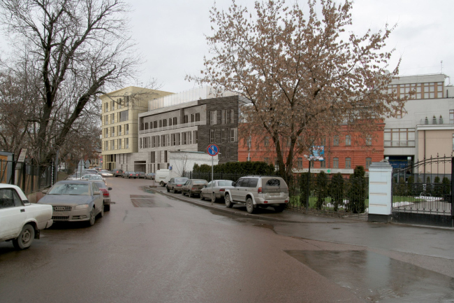
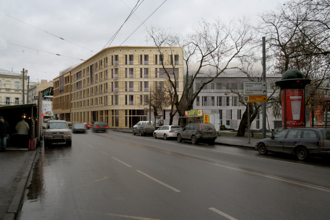
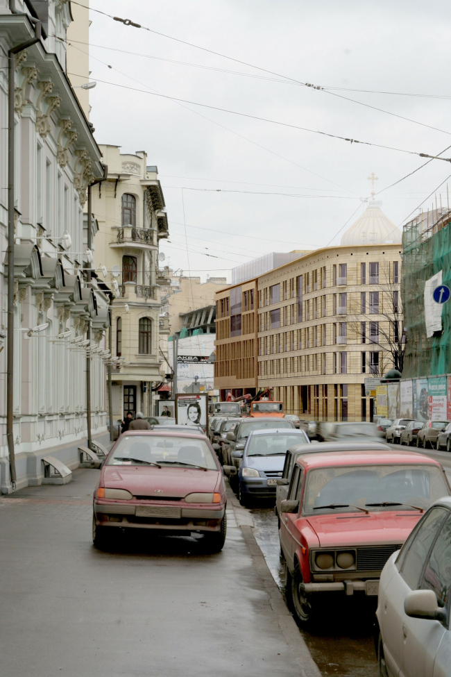
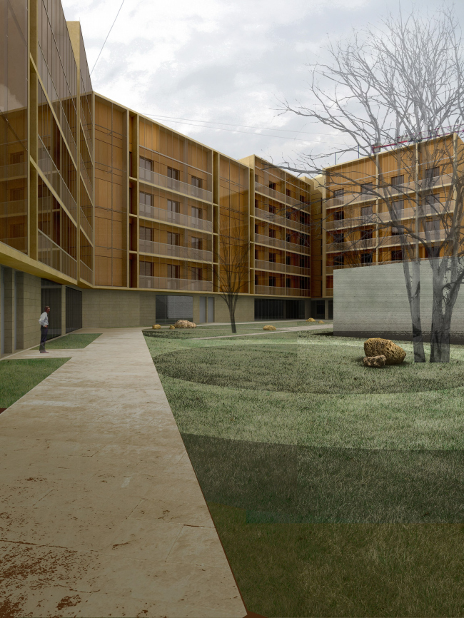
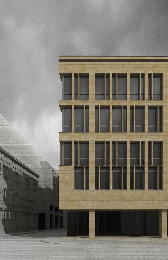
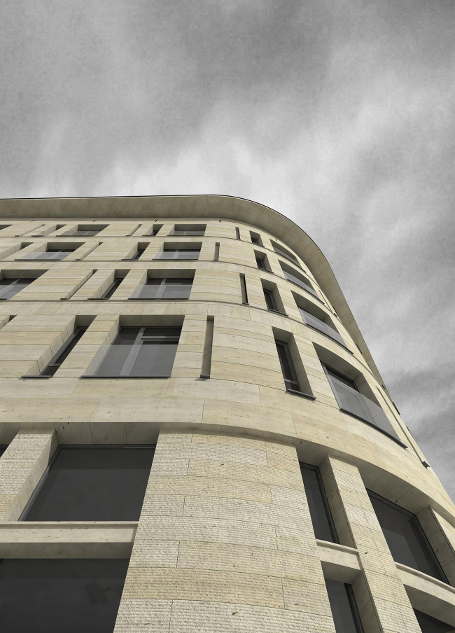
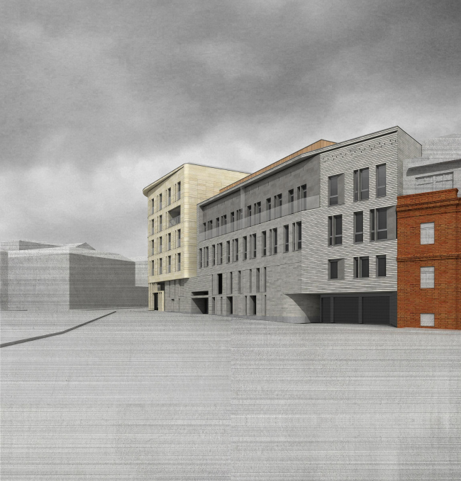
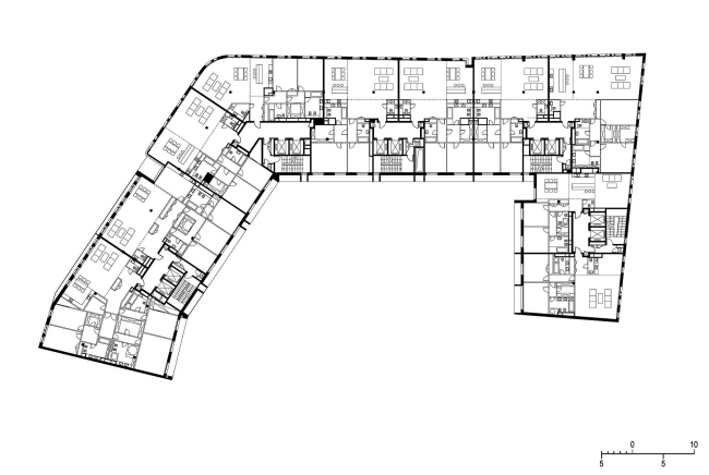
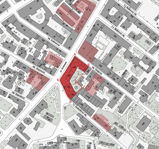
Modern Ostozhenka has many titles. The most known is the "Golden Mile" and conservancy area of modern architecture. The first says it’s a heart of the most expensive and the most elite real estate, and the second one symbolizes the place where we take foreigners who need a proof that housing in Moscow is not always a kitsch. But Ostozhenka is not just a street, but a district among it and Prechistenskaya bank line. There are a lot of genuine antiques, much of ridiculous kitsch, but it is lacking a quality of modern architecture, rather it was. "Sergei Kiselev & Partners” designed an emphatically modern and stylish building for one of the oldest and famous streets in Moscow. One of the oldest and famous streets in Moscow – Ostozhanka – is full of genuine antiques, has much of ridiculous kitsch, but it is lacking a quality of modern architecture, rather it was. "Sergei Kiselev & Partners” designed an emphatically modern and stylish building. The territory borders with the building lines of Ostozhenka and Pozharsky side street and the 1st Zachatievski side street. It had a few owner-investors before it was bought by GUP "Moscow-Center" together with partly accepted development project. The project suggested demolition of the three historic buildings and their following re-establishment in the same scale. The new building fully preserves the orginal scale of the street. In fact the volume is solid but outside it is split into different parts, and looks as different houses, imitating the historic parceling on the area. Line of the facades elegantly curves along the Ostozhenka reproducing exactly the old line of buildings. The part of the complex, which fronts the 1st Zachatevski side street is 4 storey (the others have 5 or 6) and thus considerably smoothes the change towards the nearby historic building. The architectural solution of the facade is also focused on expressing of "transition" idea. Window areas have proportions almost similar to historic, vertical stone edges create clear rhythmic similarity with the surrounding context. The side street crosses with Ostozhenka at oblique angle and this actually gives the building a smooth line smooth curve. Cross of Ostozhenka with Pozharsky is another architectural theme. Facing materials are different, there are more of large openings with transparent and opaque glass, spots of windows are deliberately dashed. The corner is very sharp and they wanted to emphasize it. Alternation of transparent edges with windows, sharp stone joints, and open gallery on the street level create a very dynamic composition bringing a clear flavor of modern age. NoneNoneNoneNoneNoneNoneNoneNoneNoneNoneNone |
|
