|
Published on Archi.ru (https://archi.ru) |
|
| 26.03.2009 | |
|
Pacified contrast |
|
|
Julia Tarabarina |
|
| Studio: | |
| Evgeniy Gerasimov & partners | |
|
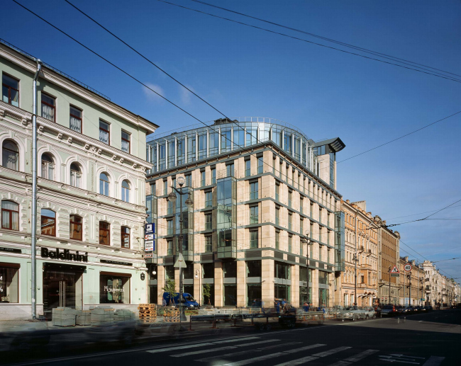
“Le Grand” building is interesting with its intricate approach to the context, it takes a few traditional ideas at a time, intensifying them with hi-tech metal. Contrast of the new and the old. Sited on Nevsky prospect. But the contrast is quieted and that is the highlight of the building.
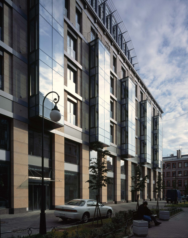
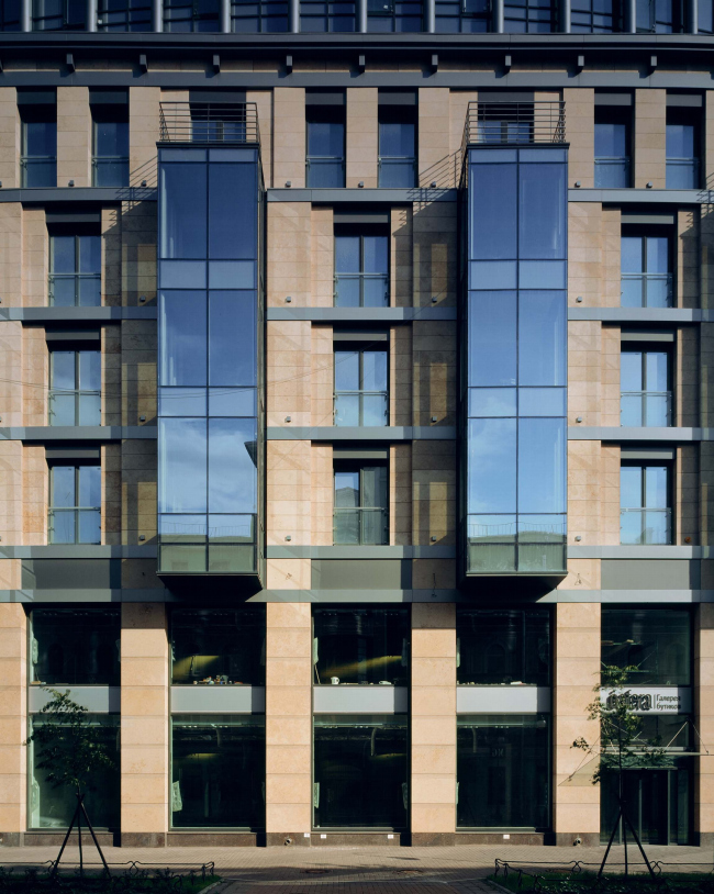
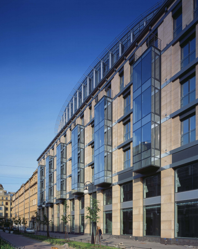
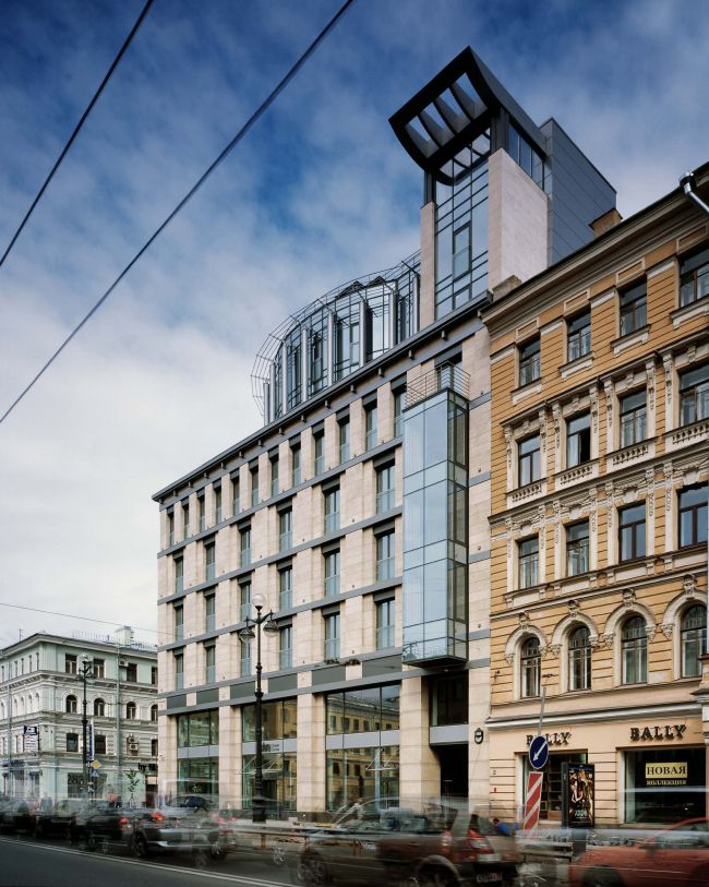
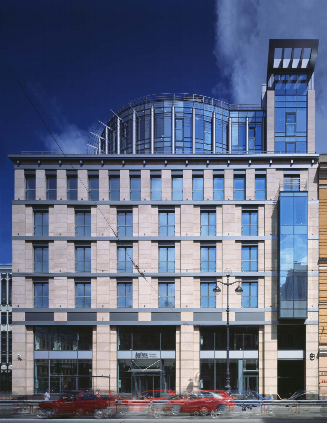
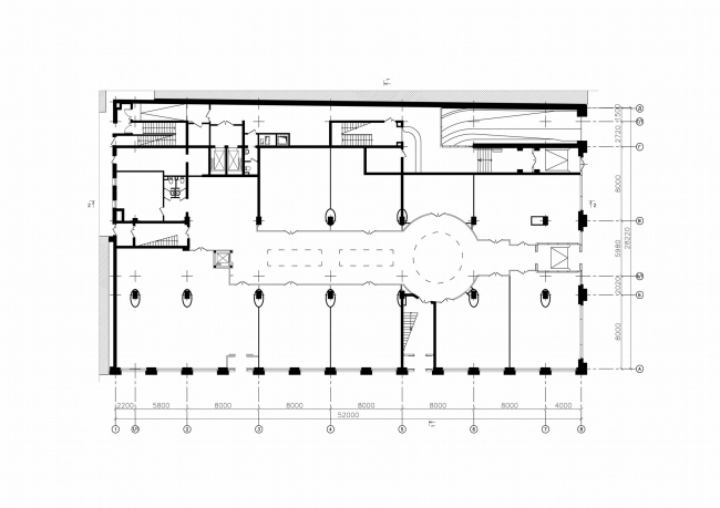
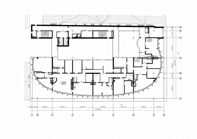
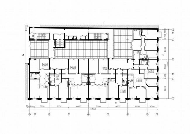
It is a chargeable matter to put a construction on Nevsky, so different things merge in the sound. The place is iconic, ensemble is integral. In a way, Nevsky avenue itself is the facade of the city and demands care and respect. Even in its part which Evgeny Gerasimenko has been developing for the last year, behind Vosstaniya square, closer to Lavra than Fontanka. Five years ago here on the odd-numbered street side was built a building with arch, which received a number of diplomas, gave birth to constructivist method with popular Piter typology of a house with a long passage yard - inner yard. Nearby, on the opposite side of the street and closer to the centre – in 2008 there was completed another building by Evgeny Gerasimov, Le Grand. The building includes the two parts, so different that at first sight one might think there are two houses – one is built into the carcass of the other. In fact everything is simpler, and more complicated at the same time. Over the volume of residential building faced with stone and neatly put in the line of Nevsky avenue’s development, there raises a glass ellipse of two-level penthouses. Bristling up with metal eaves and surrounded with metal columns, typical hi-tech. Effect similar to such of Hearst Tower in New York City designed by Norman Foster - a glass skyscraper put into the case of a classicist building of the beginning of XXth century. Only, here it is not a skyscraper and the basis of the house is not old - but obviously the idea is the same – interaction of art-deco and hi-tech, traditional and quiet, metal and dynamic, or, in the end of the old and the new. Must notice, it is more recognized here in Nevsky then in New York. Stone volume of the main building continues the line of neighboring buildings of XIXth century and follows their three-part plan: in the bottom there are wide shopwindows, and the rhythm of the second level is twice smaller than of the main part. Facades are massive and multilayered, covered with flat stone rust and pierced with verticals. On the other hand, modest stone façade accepts glass and metal. Lines of bow windows from the lane side is the brightest example, but there are also grey horizontals of interflooring lines and grey insertions in windows. Again, columns of the glass-metal volume of penthouses are here for some reason. As it is common in architecture of St.Petersburg, into the ellipse there is "sewn" classicist allusion – it is hard not to see its similarity to a rotunda crowning most pompous palaces. Metal “hedgehog” is not very like a dome – ellipse of penthouses is more like a broad marine pipe. But there remains classical outline, and there is an allusion. Alike work is seen in the inner structure of the construction. The house is comparatively small but it remarkably uses at least three layout plans. In the lower storeys there is a miniature passage among boutiques - that is quite logical for retail area. Over shops, on the level of third storey there is an inner yard with elevators, joining the two typologies: peculiar for commercial houses of Petersburg "chain" of inner yards and idea of an atrium popular nowadays. But the main idea is not in layout methods - they are the result of searches for an optimal solution for the complex site, not large and stretched deep into the lane. The main and first impression: the contrast between the two different volumes, traditional, metal-modern. The contrast, smartly used and quieted at the proper moment.NoneNoneNoneNoneLe Grand housing complexCopyright: © Evgeniy Gerasimov & PartnersNoneNoneNoneNone |
|
