|
Published on Archi.ru (https://archi.ru) |
|
| 16.03.2009 | |
|
Fusion and parting |
|
|
Julia Tarabarina |
|
| Architect: | |
| Vladimir Plotkin | |
| Studio: | |
| Creative Union ‘Reserve’ | |
|
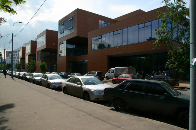
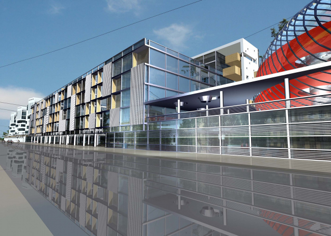
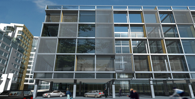
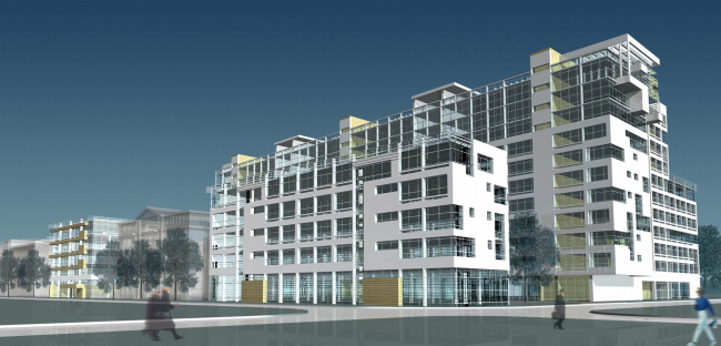
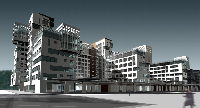
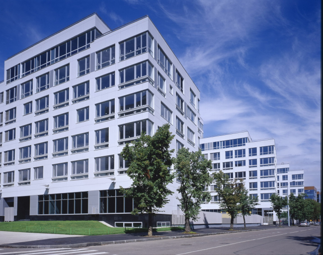
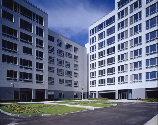
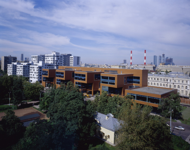
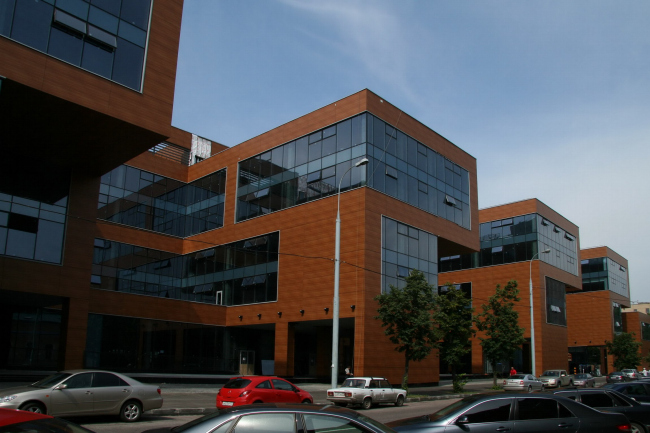
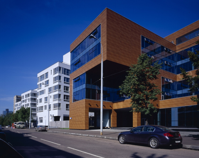
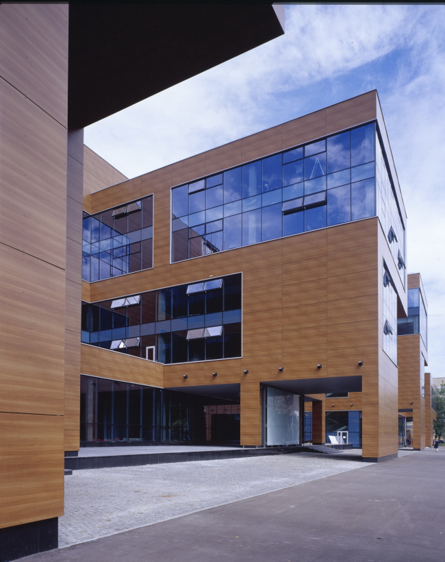
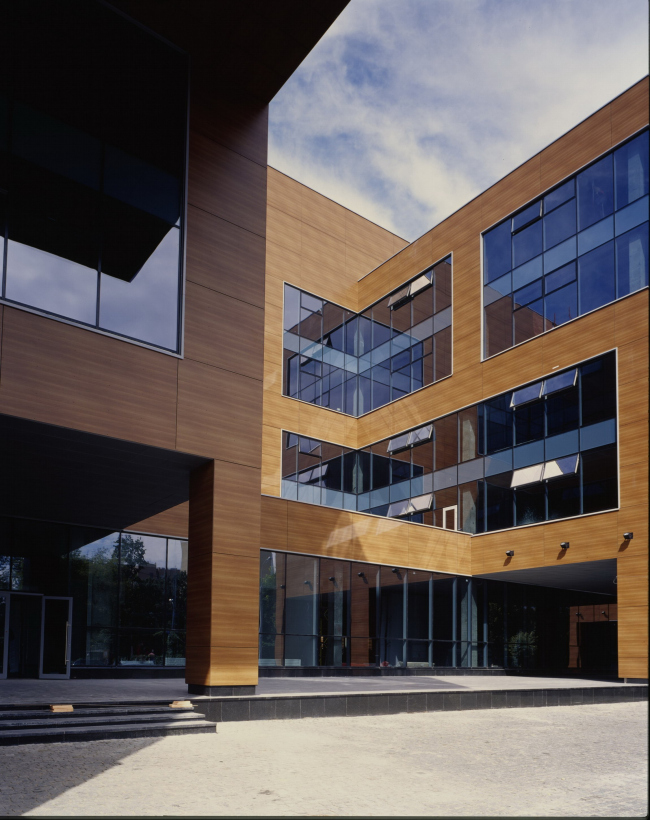
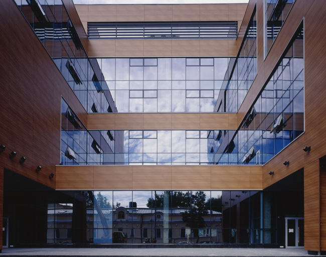
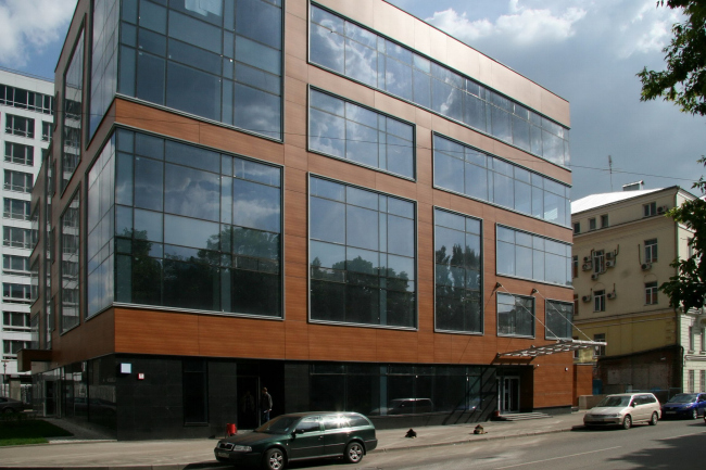
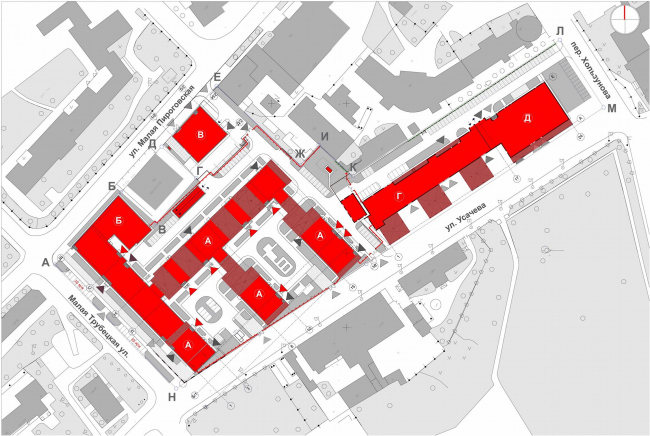
Development history of the “Fusion-park” project is a fine example how architecture depends from idea. First, the main was a museum, and mixture of forms was the theme. Then, after the museum was enclosed in body of the building, the image of complex has changed: “fusion” was replaced by opposition of “residential theme” and “work theme” in the two nearby buildings. Mixed-use complex ”Fusion-park” completed in 2008 is already famous. There appeared articles about it (during the construction and after), and in fall within “Days of architecture” there was an excursion around the absolutely new work of architect Vladimir Plotkin. Who, as we know, successfully manages building modernist constructions even in centre of the city. Last year, by the way, can be considered "fruitful" – few well-known Moscow architects completed so many constructions that busy pre-crisis year. There were three of them: Arbitration court on Seleznevsky street, Tax office on Zemlyanoi val and “Fusion-park” in Hamovniki. In my opinion, one of the interesting features of architecture of this complex is that there is a park here ( a fine one, Trubetskih or in the name of Mandelshtama) but no “fusion”(from Latin “fusion” - merge, mixture). Well, you can’t always expect from architecture being conform to a name that realtors give to a construction. Yet, “fusion” is such a stylish word, that it makes tune to it. And there was ”fusion” in the projects and that is curious. The mixed-use complex consists of three parts: an apartment building, occupying 2 of 3 ha of the territory (much for a centre), offices sited in the line along the park and Usacheva street, a museum of retro-cars. As a rule, architects deal with functions in two different ways. They mix them within slicing a building (especially this is characteristic for towers), for example, on the 5storey there are offices, on the 15th there are apartments and on the 20th storey is a hotel. Or share among separate buildings. Or there are also hybrid variants (a "sliced" tower and separate buildings). First in the project was the second variant, than the office space enclosed the museum so, that outside it was invisible, so there appeared hybrid variant. Why do we need this information – well, it seems to me, this change has considerably influenced the image of the complex. In previous variants where museum was clearly seen outside, it was like a transparent dirigible landed on the roof of the office space, with a red exposition entrance ramp inside. Like in a show-window cars would be seen but a little at distance. Just in order to outline the object, which can be seen only inside. Museum was not only an idea, but the main architectural piece, a large abstract sculpture on a pedestal. An imaginative person might define an oval in the shape of museum’s building, like a flattened comet nucleus. If so, the other two buildings could be the "tail" of the heavenly body. The idea perfectly explained the plastic of “fusion”-mixture. The office building appeared in the central part, where the gas plume of the comet is supposed to be rare. Accordingly, it has delicate, light, almost ephemeral plastic. The residential building was in the end of the "tail", where the plume warms before fading out – its facades were more brutal and the theme of “fusion” had an intense finishing chord. Then the museum disappeared out of the composition. It remains there and works (though heavy interiors were designed by another architects) – but has left as an architectural unit, having merged with the office volume. Along with it there disappears the idea, and the building changed. Instead of dynamic replacement and experiences of interosculation of chaos and the order – there shaped a division into two parts and each of them has its own, certain face. The author says they are the two neighboring buildings, with different ideas and sizes. The apartment building consists of the white checkered texture, which became the theme in the huge "Airobus"-house. The cells obviously origin from modernist high-rise buildings, but are totally transformed – light grey colour (white in the sun), borders are thin, grid is precise. Though in parts there sprout features of the former “fusion”: somewhere a window becomes smaller, drops out of the order, separation wall changes its thickness or color for grey, zigzag can be seen in the place of staircases. But there are few such places, especially in comparison with the project. Everything is orderly, clear and precise. This white grid seems to become specific character of buildings in the projects of Vladimir Plotkin, it specifies the function. This is quite a crystallized and recognizable image of a construction. In comparison with the project, the composition of residential buildings has not changed – on the plan it look like a double-sided comb, with one stretched building and three cross ones. The last go down by steps towards the Trubetskoi park, but this is rather a result of coordination formalities than an architectural idea. Office part is given to massive plastic of simple forms. Mostly it is opposite to its neighbour: the main color is dark, windows are banded, it is large: windows join two storeys. The architecture loses its lightness peculiar to a residential building, and is penetrated by laconic significance. But the main thing is that its simplicity and enlargement send us to the main source – Russian avant-garde. I can’t say if the author was thinking about architectural modernism classics, but if they had modern materials they probably would build something alike. The front facade of the office building is arranged by the four identical “Г”-shaped ledges. Their large 5storey volumes with huge corner consoles are defiantly simple. Each is more like “Р” or even “S” due to separation walls, in short, like a brutal letter of Mayakovasky, larger and coded in the building. When they are in a line – there appear allusions to scenes on Kalinina avenue in 1970, when out of illuminated windows they made words like "USSR" and "CPSU". Strange, but one of the brightest memories of the time. The effect is obvious. Well, it would be more than silly to suspect the author coding something on the construction. More seemingly here is applied a similar method: a complete form, original and noticeable, intensified by the scale and repetition – together they make an observer think it can speak. Nothing of the kind, actually – no monograms, but pure art. This office building has even more secrets-features. For example, photographer Jury Palmin found there the same perspective effect in the mirror of window reflections, like in the building of Tax office on Zemlyanoi val. Only there was just one "pseudo-street" and there are four of them here, according the number of ledges. They add intensity to the building, intricate impression and speak at a world behind the mirror. Well, the world of images is one of favourite heroes of Vladimir Plotkin’s architecture. Due to small streets half which is real and half is reflected, the author succeeded to overcome one of annoying problems of modern buildings in the city centre – a roofed gallery. Usually in Moscow they can’t make a Rivoli street, but something dark and poor, something that people keep away from, passing even along the traffic area. But everything is different here. Small columns are replaced by massive solid panels which support those ledges-“letters”. This might look gloomy. But the inner wall is entirely illuminated. Besides, the "gallery" is tore by crossed “small streets” and so gains more light and space. So, after they hid museum the complex changed, and had another theme concentrated on parting instead of fusion. Two parts contrast in a way: light and dark, quite high and stretched, small grid and large, sculptural. Yin and Yang, home and work. And during its development the project “fusion” gave place to its contrast. Remarkably, how keen was the author to changes in structure of the complex – the plan remained, and the final image was totally different. NoneNoneNoneNoneNoneNoneNoneNoneNoneNoneNoneNoneNoneNoneNoneNone |
|
