|
Published on Archi.ru (https://archi.ru) |
|
| 24.11.2008 | |
|
The house which harmonizes contrasts |
|
|
Julia Tarabarina |
|
| Architect: | |
| Sergei Tchoban | |
| Studio: | |
| Tchoban Voss Architekten | |
| Evgeniy Gerasimov & partners | |
|
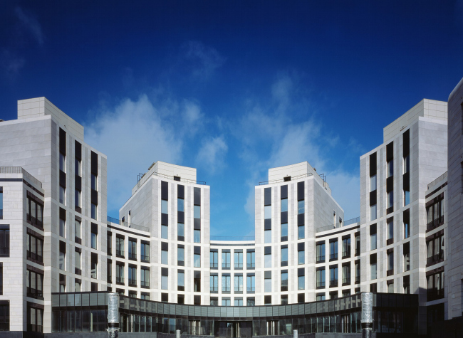
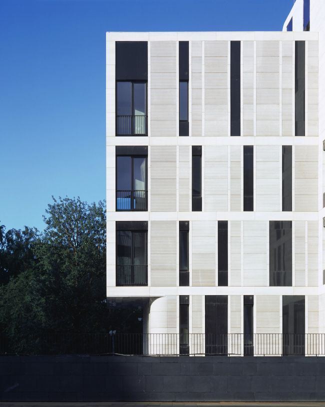
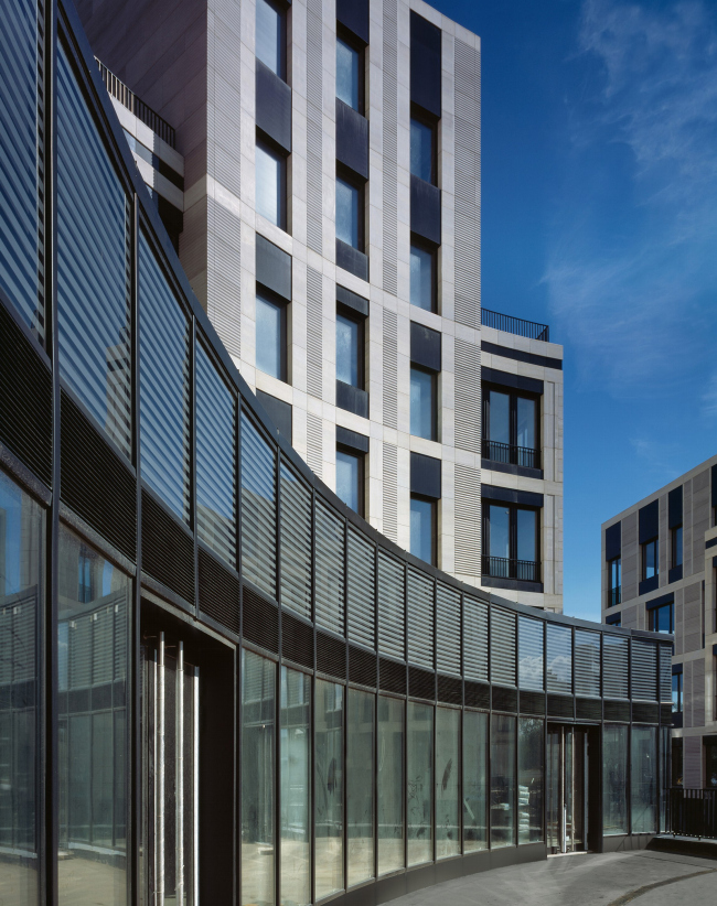
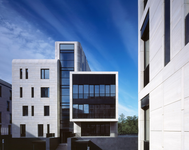
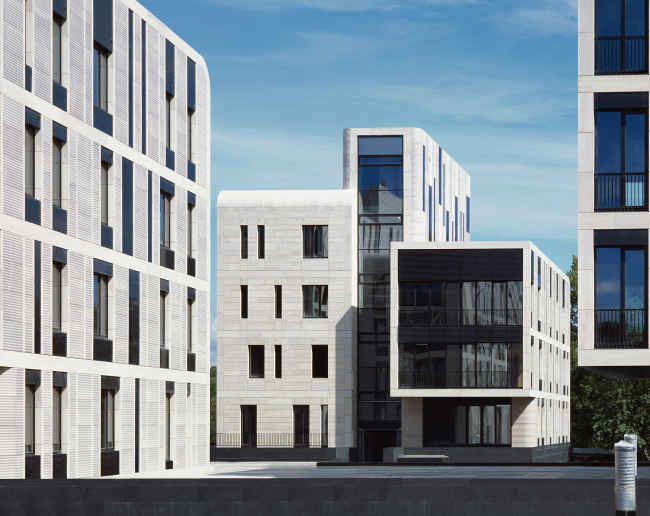
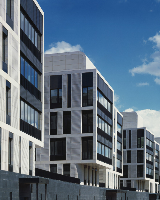
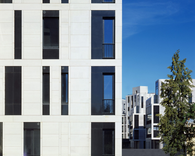
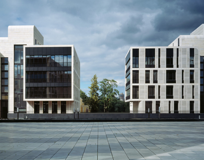
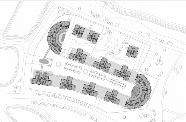
This house by the sea already has five different diplomas, newest of them is the golden diploma of "Zodchestvo"-2008. Such attention is not surprising: looking at this complex one will see that its architecture is not only charged by meanings, it easily applies techniques of the two opposite styles. Within a single ensemble the authors managed to harmonize techniques of the classics and modernism – a risky course, but in the end there is an austere, but harmonious image The place where the new house by Evgeny Gerasimov and Sergey Tchoban is built, suggests architecture the two different, even disagreeing styles. In short, they are "the sea" and "the cold" – the things that hardly go together for an average modern person. Here is the explanation. Krestovsky island is located between the two arms of Neva, Srednyaya and Malaya Nevka rivers and its western edge views the Nevskaya Guba of Baltic sea. It is the “sea façade” of the northern capital which expects severity and harmony, moderate value of Petersburg. But a sea is also yachts, walks, rest, and in combination with Krestovsky island – parks and other entertainments. .On combination of these two themes – severity of the stone Petersburg and openness of a park – is based the architecture of complex. It is hard to achieve harmony if there is a task to – the architects could do that firstly due to unusual S-shaped plan, and secondly due to the ideas of the two – must notice, antagonistic – styles. And both are closely connected. Flatted and stretched horizontally letter S with fancy calligraphical “tail” in southern edge, from above mostly reminds of curves of Neva's arms – as if it wants to fit not only in urban planning, but also geographical context. Because of this, the entire ensemble becomes unusual – instead of three long lines of buildings which seem obvious to be here, there is a “snake” curving the two long yards. Yet such geographical understanding is not main here, it is rather a by-effect. Another moment is more important. In two spots where the stone "python" turns, the buildings merge into austere, fanlike and half-circular volumes which facades are cut by verticals and are seized by a grid of windows. Not doubt this architecture is very like art-deco of 1930’s – so "focused" and classical the image is. For some reason we recollect the Chaillot Palace… Well, in two parts – where it curves – the complex gets clear palace features and makes think of classical architecture. And where the curve ends and body of the house becomes straight and stretched, the architectural solution changes – they are joined only by a stylobate and higher they part into volumes with asymmetric "free" plans. These buildings are not palaces anymore, they may remind of modernism and functionalism searches as well as of a summer residence of the neighboring Kamenny island. Comparison with a snake appears to be not so random: if we take a children's toy small snake and put it in alike manner then in spots where it curves there will be strict fan-like half-circles, in other parts will lay freely. So, “house by the sea” in the place where it curves is very like a palace, and in rest parts it is almost a modernist villa. In curved parts of the complex there rules a classical concentration and symmetry, and in stretched parts there is a romantic ease and openness. The image of a "palace" reaches apogee in the idea of front southern yard. Its ponds and fountains are built in one line continuing the axis of Grebnoi canal, and the effect is like Versailles (or like Petergof). The channel joins the perspective and takes up the role of a water orchestra. From the opposite side the stretched cour-d’honneur is solemnly closed by a semicircular building. In this way the house not only gets a sea panorama, but also underlines the remote relate to country imperial residences, with this main tourist attraction of Petersburg’s neighborhood. And its dwellers will live not only in the elite house, but almost in a palace. They will remember that when will be swimming in a pool and viewing the linear prospect of the water orchestra with fountains. By the way – in order to “open" view to the canal, they had to add a calligraphical “tail” to the plan – the space a little extends to the westward, playing with perception by rules of classicism palaces. The second yard is a little smaller and quite more modest. Following the comparison with imperial residences, we may say, the southern yard is similar to a "French" orchestra, and in northern there lives its antagonist – "English garden" with its cult of private life. Even the semicircular building here looks less solemn, and the main become asymmetrical volumes. And this is right - the character of northern yard is similar to their countryside residence atmosphere. These buildings are set of three parallelepipeds, and each such volume is a single apartment (within a level of a floor) so the lay-out of these buildings is absolutely “adequate”, following the rules of functionalism of the XXth century. Ease of the plan is also seen on facades where continuous stained-glass windows of facades-loggias are replaced by stone mass cut by thin "loopholes" of asymmetric windows. Ease and massiveness, black and white, straight and rounded corners – asymmetry goes together with contrasts. Even effects of light and shade contrast: on "front" facades the stone planes between windows are covered by sharp horizontal fluting – a version of architectural ornament which reminds of jalousie in southern cities. This decorative and graphic motive makes livelier the architectural plot and adds it some narration, forcing to recollect not only Versailles but Paris. Just by the way. So, the architecture of this complex is based on contrasts – entirely and in details. And this does not make it broken (it occurs when there is a sated play with symbols and styles). But altogether it turns out not at all provocative, but simple and harmonious. The ensemble remains very integral – some images which are most likely to conflict and contradict, surprisingly go together peacefully. Probably, it is so due to underlined severity of the architectural idea: whiteness of stone, acuteness of lines. Though in considerable degree this unexpected integrity is reached due to the perfect quality of finishing, up to ornament of stone facing with soft framing around windows. 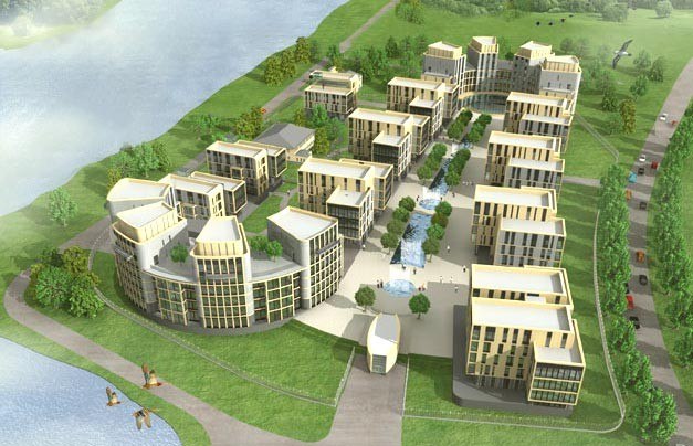 The housing project "House by the Sea". Visualization. Birds-eye view that allows to appreciate the architectural and town-planning solution and the effect of the gothic S-shaped curve of the complex © Evgeny Gerasimov and Partners, nps tchoban vossThe housing project "House by the Sea". Construction, 2008. Evgeny Gerasimov and Partners, nps tchoban voss. Photo © A.NaroditskyNoneNoneNoneNoneNoneNoneNoneNone |
|
