|
Published on Archi.ru (https://archi.ru) |
|
| 26.08.2024 | |
|
The White Wing |
|
|
Julia Tarabarina |
|
| Architect: | |
| Alexander Skokan | |
| Studio: | |
| Ostozhenka Bureau | |
|
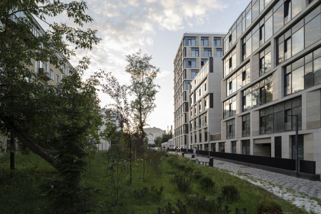
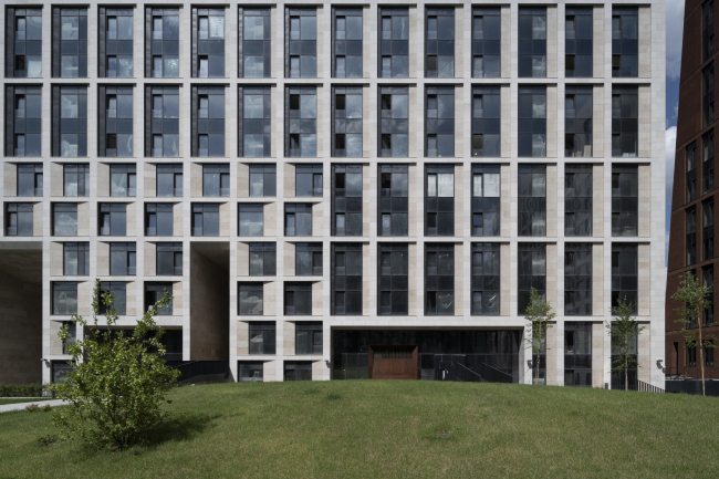
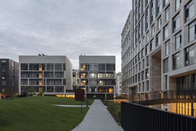
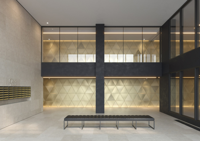
Well, it’s not exactly white. It’s more of a beige, white-stone structure that plays with the color of limestone – smoother surfaces are lighter, while rougher ones are darker. This wing unites various elements: it absorbs and interprets the surrounding themes. It responds to everything, yet maintains a cohesive expression – a challenging task! – while also incorporating recognizable features of its own, such as the dynamic cuts at the bottom, top, and middle. The northwest building of the second quarter of the “Garden Quarters” is the work of Ostozhenka Architects and it forms a somewhat asymmetrical pair with the southeast wing designed by Reserve Union. View of the minor buildings from the side of 3rd Frunzenskaya Street. “Garden Quarters” housing complex. Quarter 2, buildings 2.7-2.10Copyright: Photograph © Daniel Annenkov / provided by OstozhenkaThe paved area is a pedestrian street, and from there, you can turn slightly right, descending a bit: here, in the gaps between the low-rise buildings, are two platforms with glass railings offering views into the courtyard of the second quarter, making it somewhat less secluded from the city. One platform is located between the black and white buildings, the other between the white building’s sections. The first platform hosts a shop, and the second has a café where you can sit comfortably – it’s not exactly secluded, but it’s a quiet and cozy nook with a view of the courtyard from above. It’s indeed a true balcony, an original spatial solution that fits into the multi-level concepts, which have been a signature technique, almost a credo of the “Garden Quarters” since the project first appeared in the public eye. 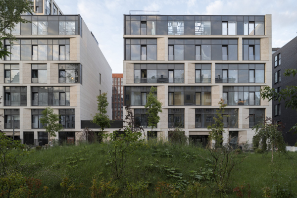 “Garden Quarters” housing complex. Quarter 2, buildings 2.7-2.10Copyright: Photograph © Daniel Annenkov / provided by Ostozhenka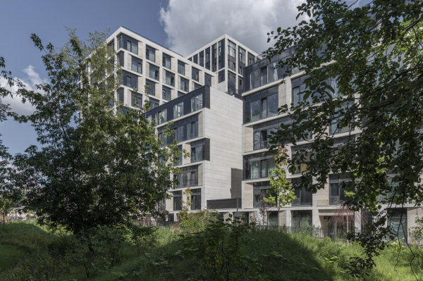 View of the minor buildings from the side of 3rd Frunzenskaya Street. “Garden Quarters” housing complex. Quarter 2, buildings 2.7-2.10Copyright: Photograph © Daniel Annenkov / provided by Ostozhenka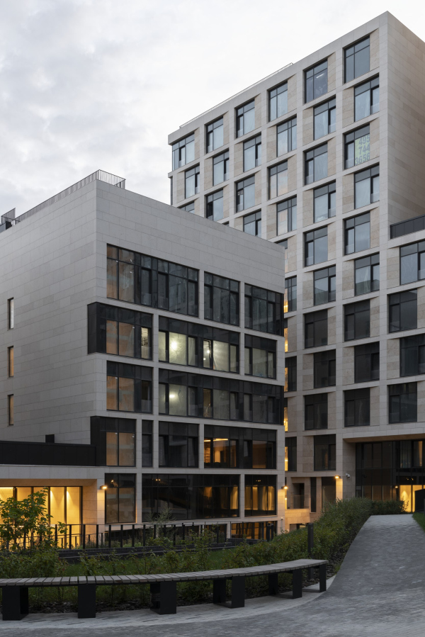 “Garden Quarters” housing complex. Quarter 2, buildings 2.7-2.10Copyright: Photograph © Daniel Annenkov / provided by Ostozhenka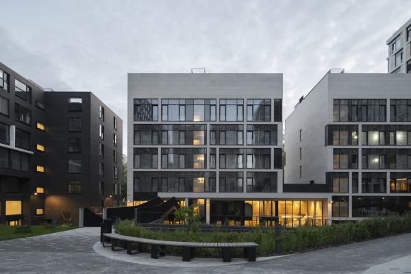 View of the monor buildings from the yard. “Garden Quarters” housing complex. Quarter 2, buildings 2.7-2.10Copyright: Photograph © Daniel Annenkov / provided by OstozhenkaThe Ostozhenka building takes up two-thirds of the “city balcony”, as its low-rise section extends twice as far south. The building itself is taller and more massive than its neighbor, with only two steps instead of three. The larger volume, starting from the neighboring 17-story brick building designed by Sergey Skuratov, stretches to 14 stories along two-thirds of its length, combining three sections, and then drops by only two floors, to twelve, before it turns and halves to six stories in two volumes along 3rd Frunzenskaya Street. However, there are more ledges and cuts here, especially in the lower part: a large archway, five stories high, one of Ostozhenka’s favorite techniques, plus a through “window” in the body of the building where one of the courtyard bridges adjoins. 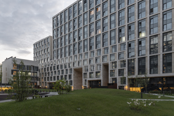 “Garden Quarters” housing complex. Quarter 2, buildings 2.7-2.10Copyright: Photograph © Daniel Annenkov / provided by Ostozhenka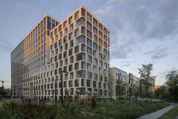 “Garden Quarters” housing complex. Quarter 2, buildings 2.7-2.10Copyright: Photograph © Daniel Annenkov / provided by OstozhenkaIf you look at the façade pattern, it doesn’t follow the rhythmic step of the five sections that make up the extended volume but instead turns into a puzzle reminiscent of Tetris: it’s as if two volumes are joined here – one partially mirrors the steps of the building designed by Reserve Union, but asymmetrically and in the opposite direction. The grid of its facades is noticeably more material, as it uses splayed reveals that widen the spaces between the windows. The other volume seems to be placed on top of it – its grid of reveals, on the contrary, is thin, grouping the windows in pairs vertically, and besides that, it “dissolves” towards the south as the stone gradually gives way to black metallic inserts. To some extent, it reflects the more rigid and measured black structure, but not like in a mirror, more like in water – not in the exact way, not even as a reflection, but more like a retelling. Some kind of dialogue, which is not even a dialogue after all, not really. 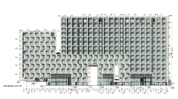 “Garden Quarters” housing complex. Quarter 2, buildings 2.7-2.10Copyright: © Ostozhenka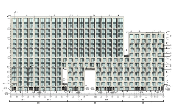 “Garden Quarters” housing complex. Quarter 2, buildings 2.7-2.10Copyright: © OstozhenkaThe theme is repeated on the exterior façade, and as we observe it, we see that three frames above the lobby’s stained glass contribute to the stepped form within the courtyard. “Garden Quarters” housing complex. Quarter 2, buildings 2.7-2.10Copyright: Photograph © Daniel Annenkov / provided by OstozhenkaHowever, there is quite a bit of dynamism on the facades. For instance, on the end of the elongated building, the grid in the upper part gradually loses its reveals – the two themes, voluminous and thin-boned, blend together unobtrusively. 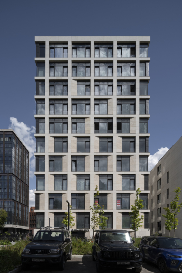 “Garden Quarters” housing complex. Quarter 2, buildings 2.7-2.10Copyright: Photograph © Daniel Annenkov / provided by Ostozhenka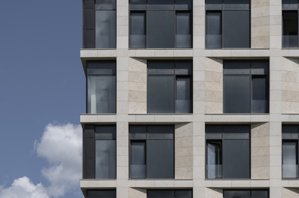 “Garden Quarters” housing complex. Quarter 2, buildings 2.7-2.10Copyright: Photograph © Daniel Annenkov / provided by OstozhenkaAnd if we look at the smaller buildings, there’s even less stone “matter” there. From the courtyard side, their facades transform into a veritable Mondrian-esque pattern, resembling an asymmetric “sliding puzzle”. On the outside, they are voluminous with reveals, while inside, they become two-dimensional and purely graphical. This is beautiful, light, and harmonizes well with the dark building designed by Reserve Union, which gravitates towards flatness. 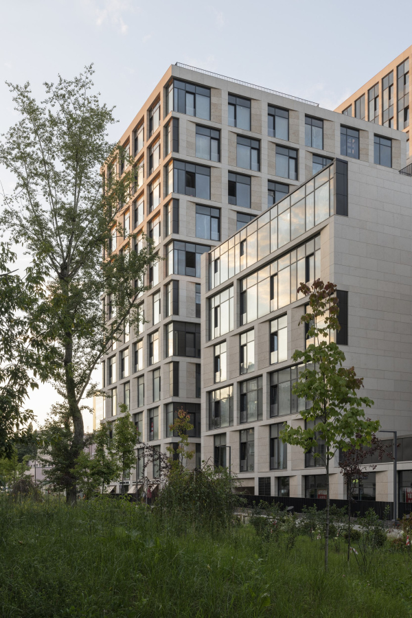 “Garden Quarters” housing complex. Quarter 2, buildings 2.7-2.10Copyright: Photograph © Daniel Annenkov / provided by Ostozhenka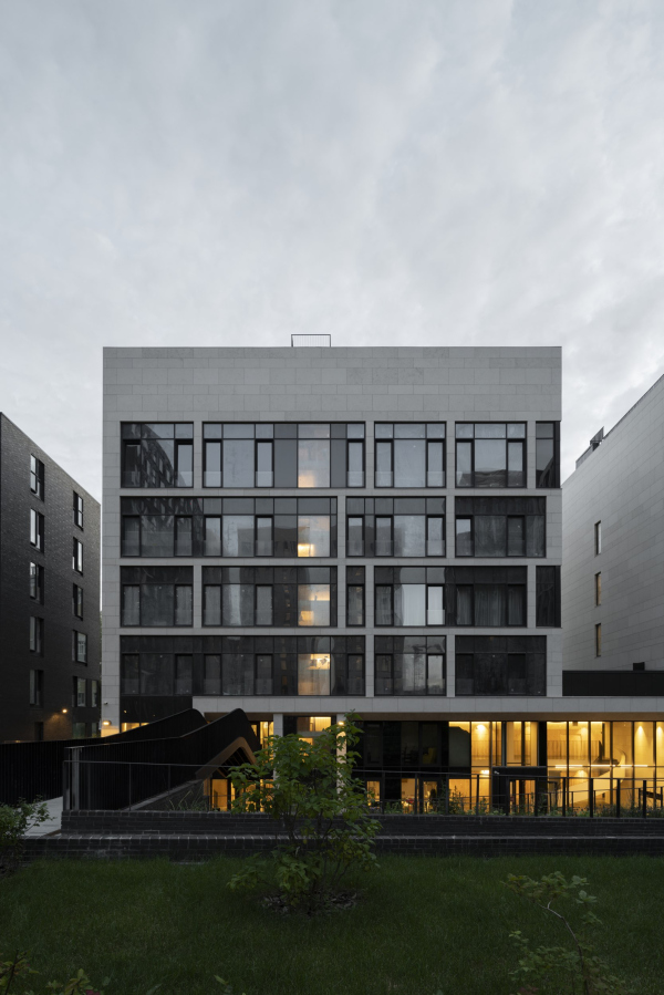 “Garden Quarters” housing complex. Quarter 2, buildings 2.7-2.10Copyright: Photograph © Daniel Annenkov / provided by OstozhenkaJust a couple of techniques: stone bevels, steps, black metal inserts – but there are many variations of the “melody”, with emphasis sometimes on rhythm, sometimes on volume, sometimes on flatness and line. I believe such diversity became possible because, unlike the neighboring building, essentially only one material was used on the facades of this building. Glass, tinted glass, and black metal as “background” participants don’t count: here, limestone, white stone, is the dominant material. 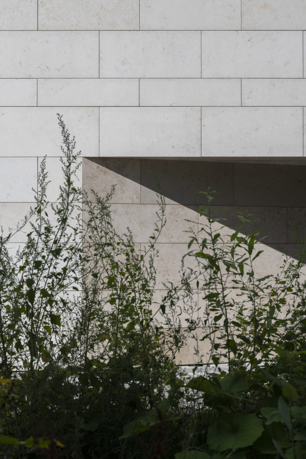 “Garden Quarters” housing complex. Quarter 2, buildings 2.7-2.10Copyright: Photograph © Daniel Annenkov / provided by Ostozhenka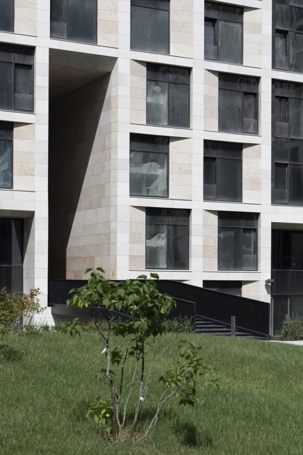 “Garden Quarters” housing complex. Quarter 2, buildings 2.7-2.10Copyright: Photograph © Daniel Annenkov / provided by OstozhenkaAnd this is very important because the foundation of the “Garden Quarters” design code is brick and white stone. But if you look globally, there’s more brick in the “Garden Quarters”. In our building, however, it’s just stone. In this, the Ostozhenka building echoes the two buildings by Sergey Skuratov, flanking Roman Klein’s building on Usacheva Street. Their slanted facades form a giant “portal” on either side of Klein, which is echoed on a smaller scale by the rough stone reveals against the smooth exterior surface. Similar reveals, accompanied by stone “steps” accentuating the grid lines, are also present in Skuratov’s stone buildings within the second quarter, on the pond side. Ostozhenka draws inspiration from its neighbors, incorporating both steps and reveals, but separates them: the first for the fine grid, the second for the denser one. 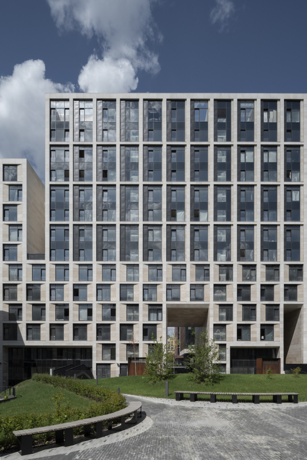 “Garden Quarters” housing complex. Quarter 2, buildings 2.7-2.10Copyright: Photograph © Daniel Annenkov / provided by Ostozhenka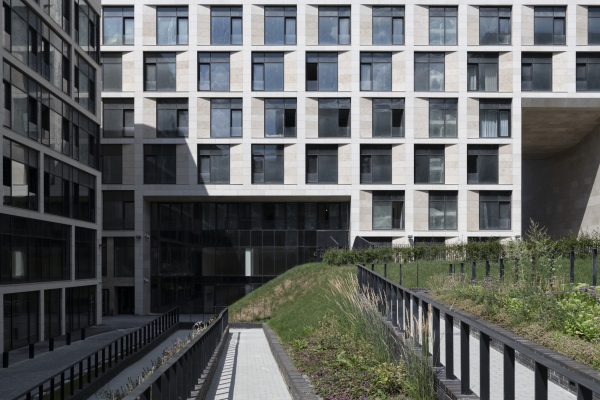 “Garden Quarters” housing complex. Quarter 2, buildings 2.7-2.10Copyright: Photograph © Daniel Annenkov / provided by OstozhenkaThe two types of grids – vertical and horizontal, thin and voluminous – also respond to the characteristics of the two neighboring buildings. The thin vertical grid employs the characteristic gradient of gradual “dissolution” of mass (and sometimes color) typical of the “Garden Quarters” and Sergey Skuratov’s buildings, while the horizontal one echoes the chessboard rhythm of Plotkin’s building. The “Ostozhenka” building unifies and reconciles these elements through both material and composition. It’s as if it says: we can live together peacefully! And indeed, there is no radical contradiction between the vertical and horizontal structures when they are side by side – it’s even more enjoyable. However, it’s fascinating to observe how sensitively this building responds to all the features of its surroundings while maintaining the integrity of its expression, largely thanks to the material. 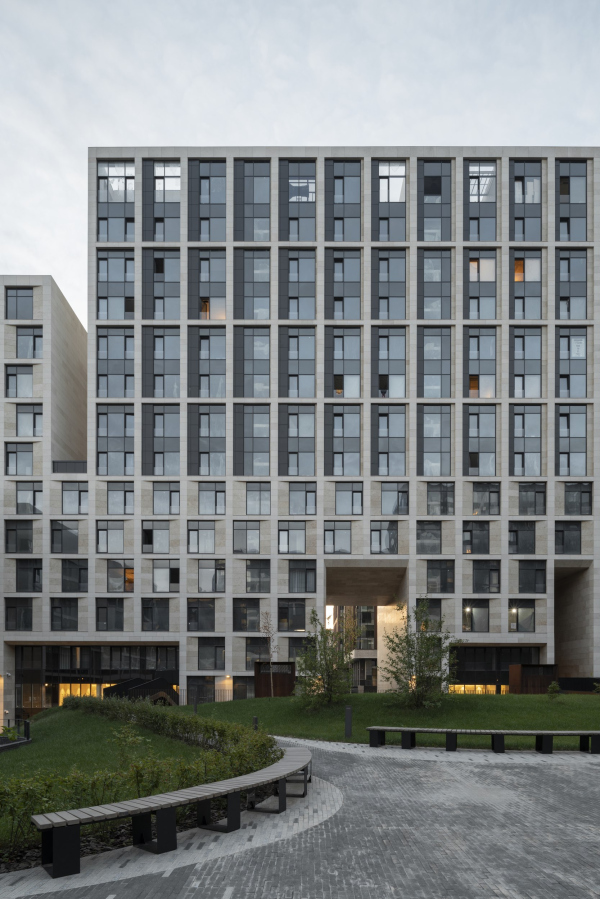 “Garden Quarters” housing complex. Quarter 2, buildings 2.7-2.10Copyright: Photograph © Daniel Annenkov / provided by Ostozhenka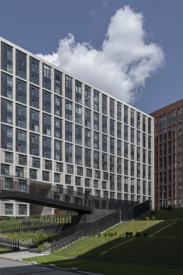 “Garden Quarters” housing complex. Quarter 2, buildings 2.7-2.10Copyright: Photograph © Daniel Annenkov / provided by OstozhenkaThis brings us back to the “Mondrianesque pattern”, mentioned earlier, on the inner side of the smaller volumes – because, when looking at the “Ostozhenka” building as a whole, one can see a progression: from the northeastern pole, where it neighbors Skuratov’s brick building (there the grid is strict and vertical) to the southern buildings (where the grid stretches as in knit weaving, but more geometrically). Finally, in the courtyard, the grid flattens out, transforming into an “abstract painting”. “Garden Quarters” housing complex. Quarter 2, buildings 2.7-2.10Copyright: Photograph © Daniel Annenkov / provided by OstozhenkaAnd the cutouts – they are significant here, not only dividing the building into parts “for ventilation” but also creating axes, at least two transverse ones, through the courtyard, at the top and bottom. Their shape echoes the window reveals: for example, the upper lintels of the “arches” flare out toward the courtyard. 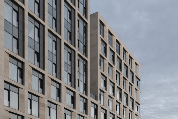 “Garden Quarters” housing complex. Quarter 2, buildings 2.7-2.10Copyright: Photograph © Daniel Annenkov / provided by Ostozhenka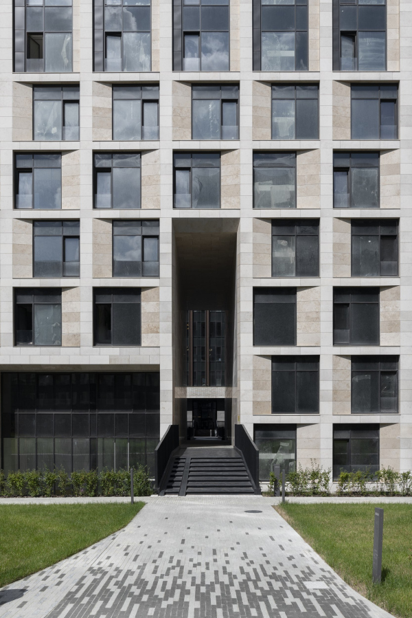 “Garden Quarters” housing complex. Quarter 2, buildings 2.7-2.10Copyright: Photograph © Daniel Annenkov / provided by OstozhenkaThese facades are full of movement, inviting you to examine them, compare the parts, ask yourself – why is it like this? Answer that question, move on... The façade grid tells a whole fascinating story here. 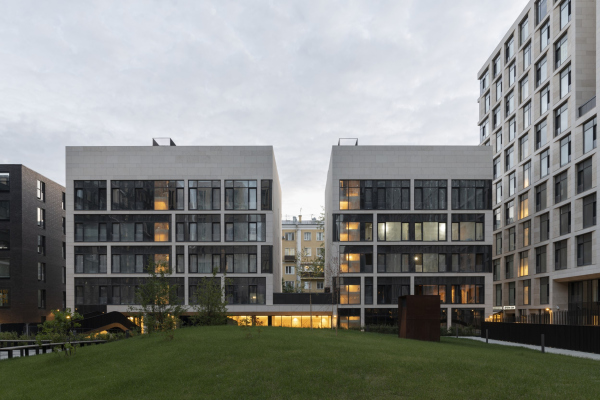 “Garden Quarters” housing complex. Quarter 2, buildings 2.7-2.10Copyright: Photograph © Daniel Annenkov / provided by Ostozhenka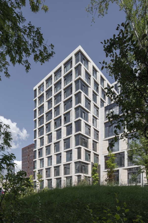 “Garden Quarters” housing complex. Quarter 2, buildings 2.7-2.10Copyright: Photograph © Daniel Annenkov / provided by Ostozhenka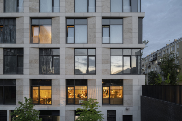 “Garden Quarters” housing complex. Quarter 2, buildings 2.7-2.10Copyright: Photograph © Daniel Annenkov / provided by Ostozhenka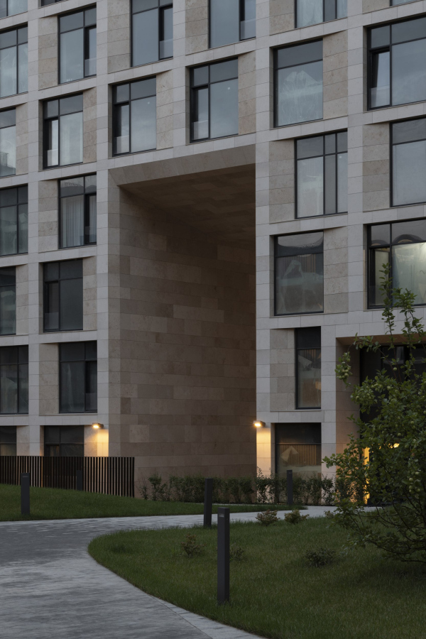 “Garden Quarters” housing complex. Quarter 2, buildings 2.7-2.10Copyright: Photograph © Daniel Annenkov / provided by Ostozhenka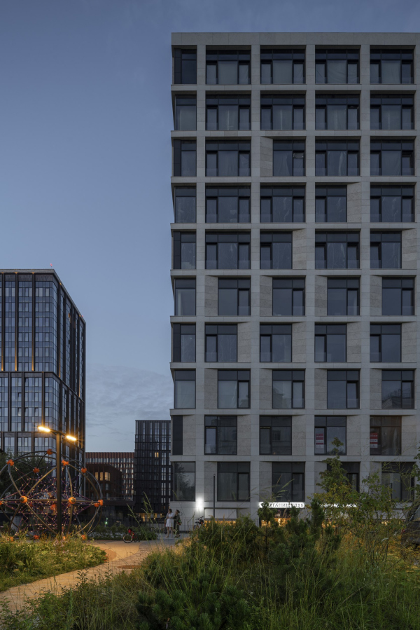 “Garden Quarters” housing complex. Quarter 2, buildings 2.7-2.10Copyright: Photograph © Daniel Annenkov / provided by Ostozhenka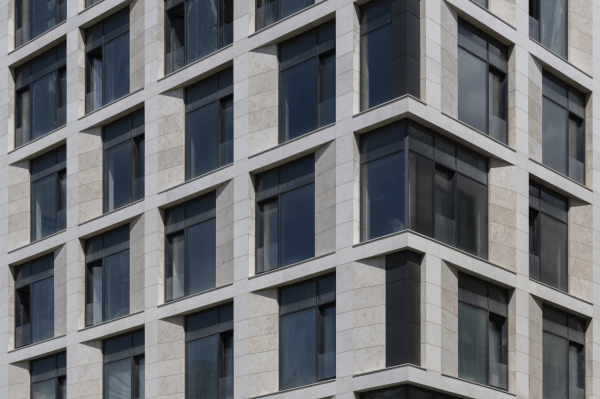 “Garden Quarters” housing complex. Quarter 2, buildings 2.7-2.10Copyright: Photograph © Daniel Annenkov / provided by Ostozhenka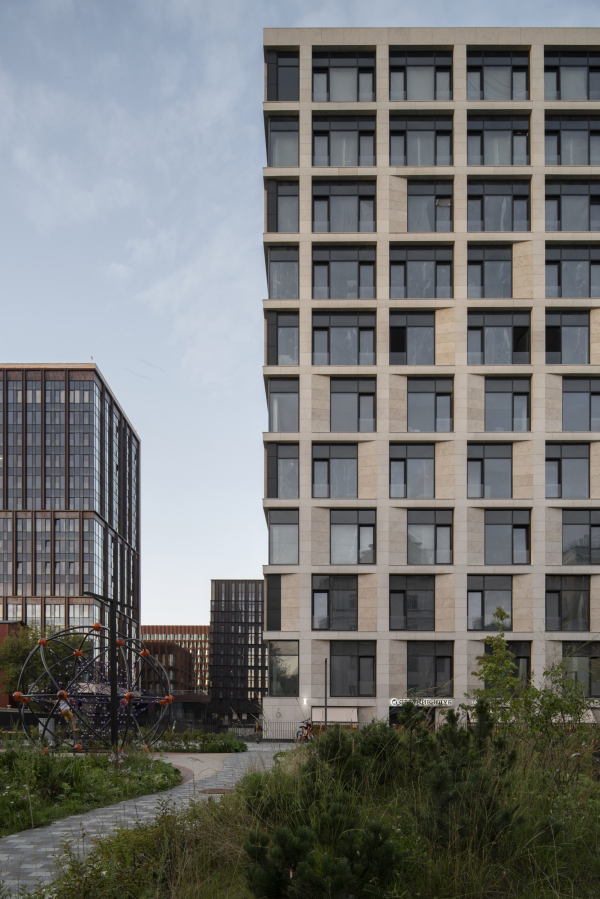 “Garden Quarters” housing complex. Quarter 2, buildings 2.7-2.10Copyright: Photograph © Daniel Annenkov / provided by Ostozhenka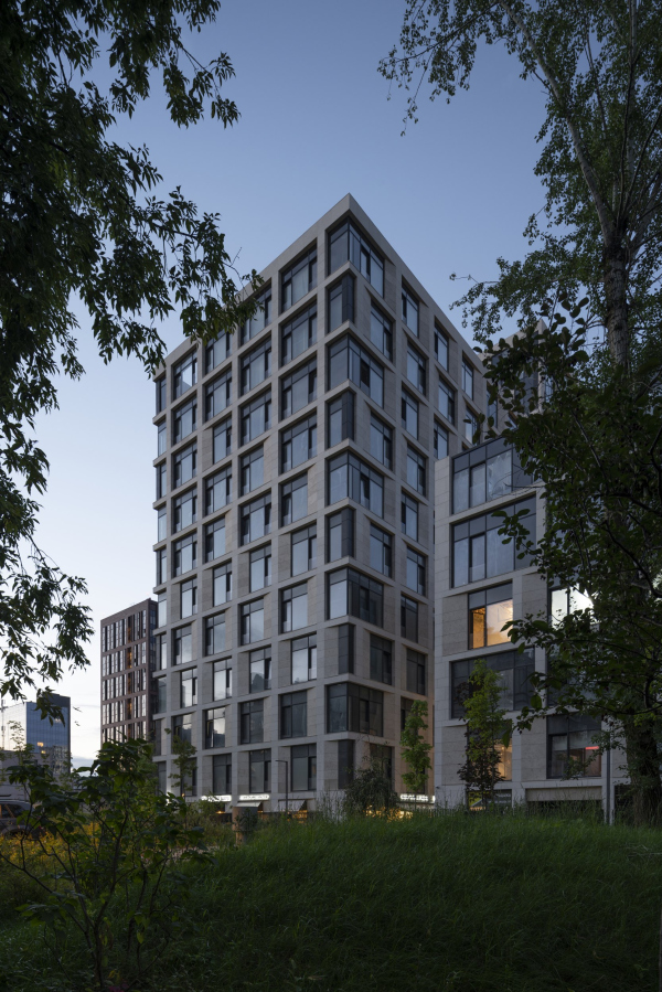 “Garden Quarters” housing complex. Quarter 2, buildings 2.7-2.10Copyright: Photograph © Daniel Annenkov / provided by Ostozhenka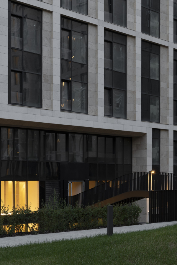 “Garden Quarters” housing complex. Quarter 2, buildings 2.7-2.10Copyright: Photograph © Daniel Annenkov / provided by Ostozhenka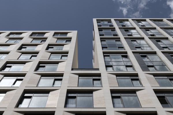 “Garden Quarters” housing complex. Quarter 2, buildings 2.7-2.10Copyright: Photograph © Daniel Annenkov / provided by Ostozhenka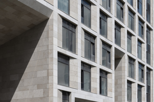 “Garden Quarters” housing complex. Quarter 2, buildings 2.7-2.10Copyright: Photograph © Daniel Annenkov / provided by Ostozhenka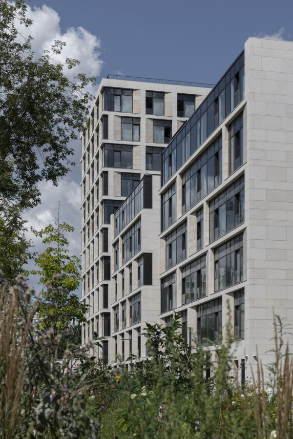 “Garden Quarters” housing complex. Quarter 2, buildings 2.7-2.10Copyright: Photograph © Daniel Annenkov / provided by OstozhenkaThe duplex apartments in the “Ostozhenka” building are situated in the upper sections of all the blocks, including the smaller six-story ones. Each of these apartments is equipped with fireplaces, and in the smaller blocks, every apartment on all floors has a fireplace. The duplex apartments also feature terraces: in the smaller volumes, they face the pedestrian boulevard of 3rd Frunzenskaya Street, while in the apartments grouped along the inner contour of the extended block, the terraces overlook the courtyard. It’s worth noting that the terraces in the “Ostozhenka” building are completely hidden from the outside; they are more like patios, open to the sky but enclosed on all four sides by windows. Without prior knowledge, it’s impossible to guess the intricate design of the upper part of the building. The architects themselves acknowledge that it was the upper section, and not the façade, that became the “real puzzle”. And, as we can see, this puzzle was successfully solved. 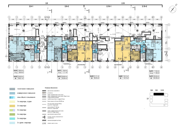 “Garden Quarters” housing complex. Quarter 2, buildings 2.7-2.10Copyright: © Ostozhenka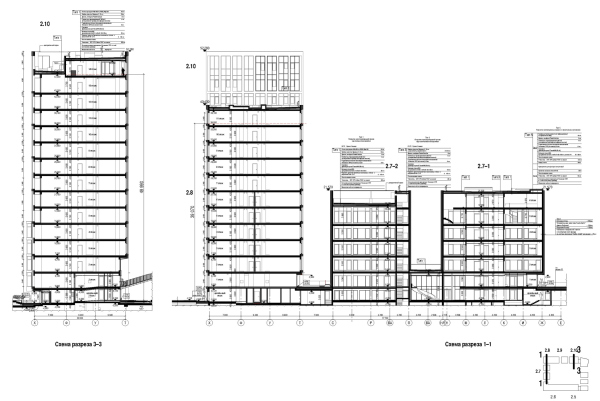 “Garden Quarters” housing complex. Quarter 2, buildings 2.7-2.10. Cross-section 1-1 and 3-3Copyright: © Ostozhenka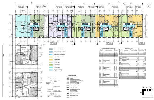 “Garden Quarters” housing complex. Quarter 2, buildings 2.7-2.10. Plan of the 7th floor at +21.600 elevationCopyright: © Ostozhenka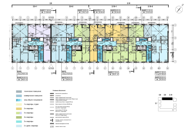 “Garden Quarters” housing complex. Quarter 2, buildings 2.7-2.10. Plan of the 13th floor at +43.200 elevationCopyright: © Ostozhenka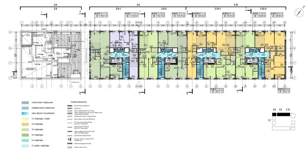 “Garden Quarters” housing complex. Quarter 2, buildings 2.7-2.10. Plan of the 2nd floor at +39.600 elevationCopyright: © Ostozhenka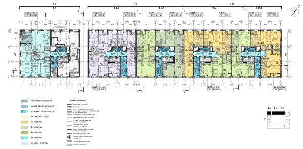 “Garden Quarters” housing complex. Quarter 2, buildings 2.7-2.10. Plan of the 11th floor at +36.000 elevationCopyright: © Ostozhenka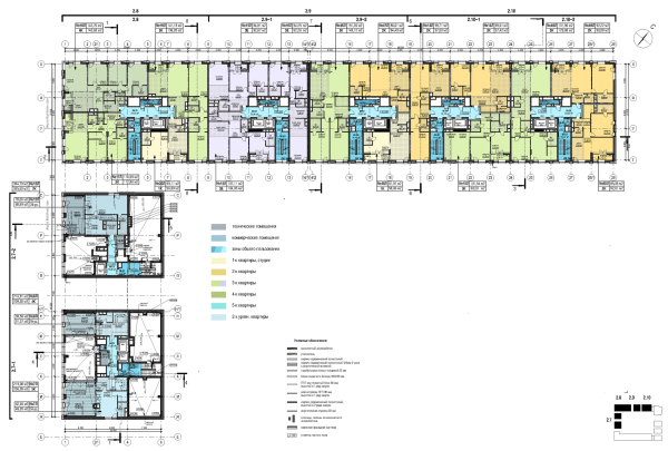 “Garden Quarters” housing complex. Quarter 2, buildings 2.7-2.10. Plan of the 6th floor at +18.000 elevationCopyright: © Ostozhenka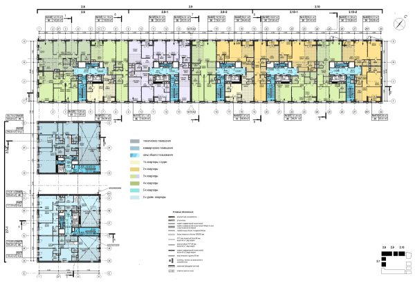 “Garden Quarters” housing complex. Quarter 2, buildings 2.7-2.10. Plan of the 5th floor at +14.400 elevationCopyright: © Ostozhenka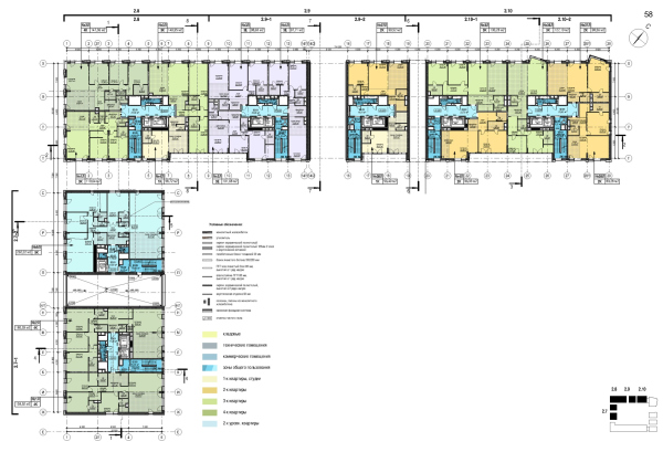 “Garden Quarters” housing complex. Quarter 2, buildings 2.7-2.10. Plan of the 2nd floor at +3.600 elevationCopyright: © Ostozhenka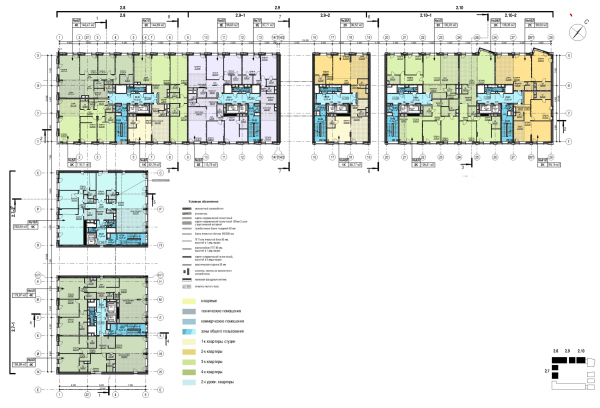 “Garden Quarters” housing complex. Quarter 2, buildings 2.7-2.10. Plan of the 3rd floor at +7.200 elevationCopyright: © Ostozhenka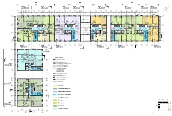 “Garden Quarters” housing complex. Quarter 2, buildings 2.7-2.10. Plan of the 4th floor at +10.800 elevationCopyright: © Ostozhenka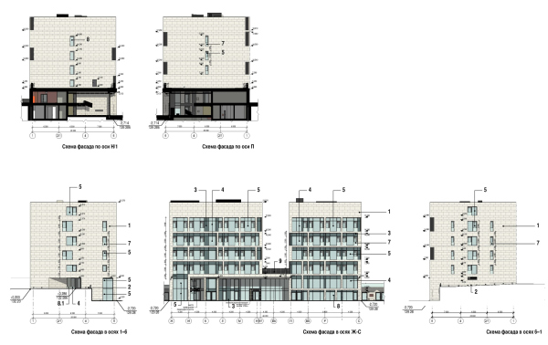 “Garden Quarters” housing complex. Quarter 2, buildings 2.7-2.10Copyright: © Ostozhenka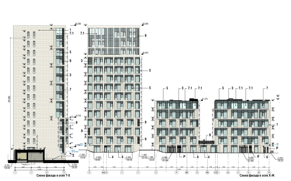 “Garden Quarters” housing complex. Quarter 2, buildings 2.7-2.10Copyright: © Ostozhenka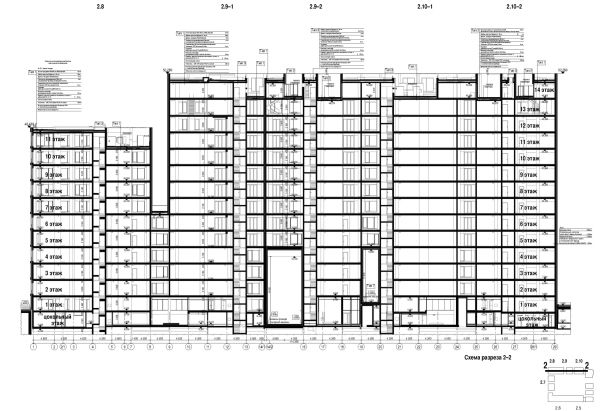 “Garden Quarters” housing complex. Quarter 2, buildings 2.7-2.10. Cross-section 2-2Copyright: © OstozhenkaThe lobby interiors, which in the “Garden Quarters” were designed by the authors of each building – tall, two-story spaces – in this case, like the façades, balance on the edge between resonating with the neighbors and making their own statement. Firstly, all the lobbies feature golden triangles – a motif that feels like a symbol of our time. However, the architects do not use these triangles to create flexible forms, limiting them to a background element on the walls. Some of the triangles are smooth, while others are textured, echoing the treatment of the façades, where limestone is rough (honed) on the main surface and smooth (polished) on the reveals. Interestingly, the polished reveals are darker, revealing cuts of prehistoric shells. “Garden Quarters” housing complex. Quarter 2, buildings 2.7-2.10Copyright: © Ostozhenka“The main idea of the lobby interiors was to connect all the lobbies with a “golden ribbon”” says Ksenia Berdnikova, the chief architect of the project. Indeed, the entrance areas are spacious frames with glass walls, their spaces, especially in the evening, glowing with a warm golden light. The stone from the façades continues inside, and black elements echo the black inserts outside; however, in the interior, their role is more active rather than just a background.  The first sketch of the entrance groups. “Garden Quarters” housing complex. Quarter 2, buildings 2.7-2.10Copyright: © Ostozhenka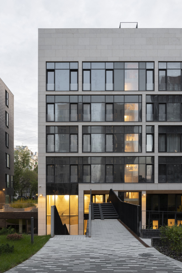 “Garden Quarters” housing complex. Quarter 2, buildings 2.7-2.10Copyright: Photograph © Daniel Annenkov / provided by Ostozhenka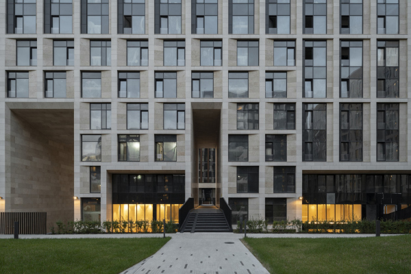 “Garden Quarters” housing complex. Quarter 2, buildings 2.7-2.10Copyright: Photograph © Daniel Annenkov / provided by OstozhenkaThe most striking element in the lobby of the “Ostozhenka” building is the black spiral staircase – an eternal, nearly timeless method for organizing space in a dramatic fashion. 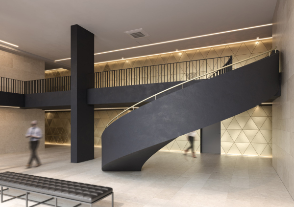 “Garden Quarters” housing complex. Quarter 2, buildings 2.7-2.10Copyright: © Ostozhenka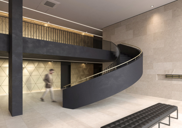 The lobby project. “Garden Quarters” housing complex. Quarter 2, buildings 2.7-2.10Copyright: © OstozhenkaThus, both signature buildings, one designed by Reserve Union and the other by Ostozhenka, mark the culmination of an 18-year-long saga of constructing the iconic residential complex in the heart of Moscow’s elite Khamovniki district. This complex has become a core, a kind of “spine”, both conceptually and plastically, in the history of Moscow residential construction over the past decades and within the city’s urban landscape. It is definitely a highlight by any standards. The two signature buildings bring this saga to a close – each in its own way. They conclude it by conversing with each other while maintaining their distinct characters and individual expressions. In this architectural dialogue, the “Ostozhenka” building plays a more communicative role. |
|
