|
Published on Archi.ru (https://archi.ru) |
|
| 15.08.2024 | |
|
Projection of the Quarter |
|
|
Julia Tarabarina |
|
| Architect: | |
| Vladimir Plotkin | |
| Studio: | |
| Creative Union ‘Reserve’ | |
|
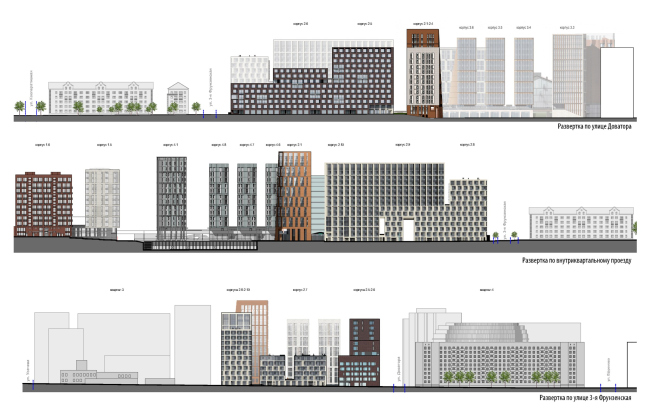
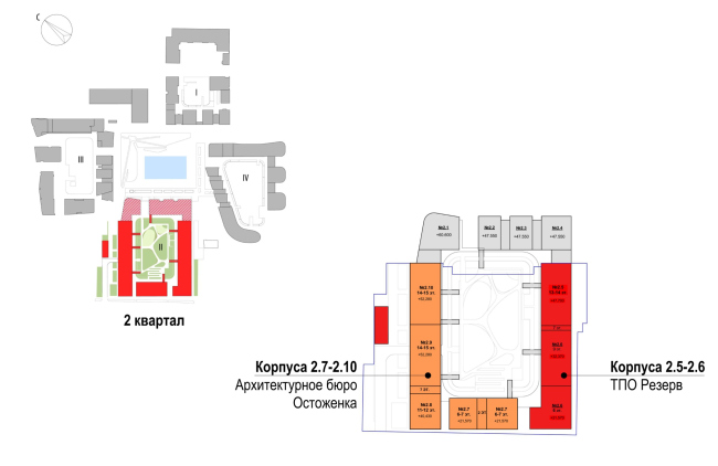
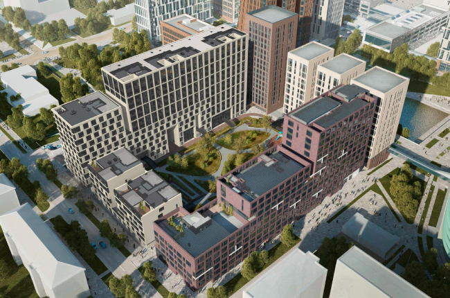
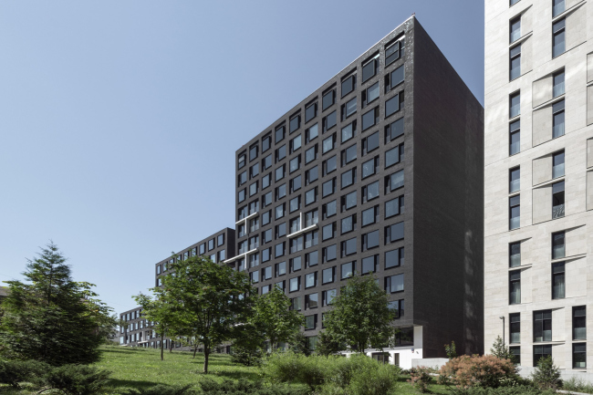
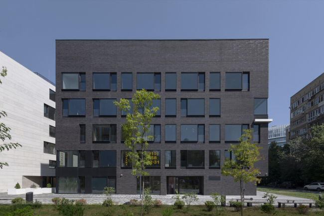
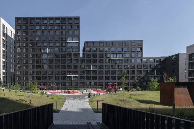
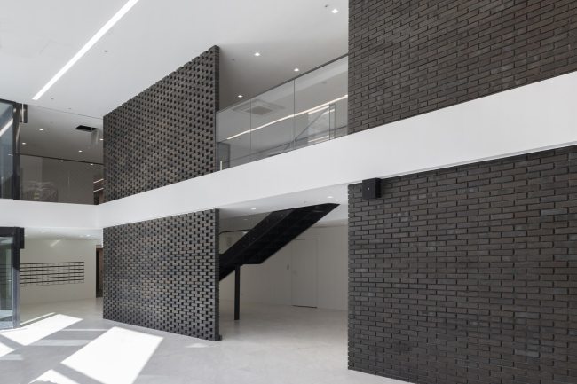
No one doubted that the building that Vladimir Plotkin designed as part of the “Garden Quarters” would be the most modernist of all. And it turned out just that way: while adhering to the common design code, the building successfully combines brick and white stone, rhythmically responding to the neighboring building designed by Ostozhenka, yet tactfully and persistently making a few statements of its own. This includes the projection of the ideal urban development composition “14–9–6”, which can be found right next door, mathematical calculations, including those for various types of terraces (and perhaps the only reminder of the Soviet past of the Kauchuk rubber factory!), and the white “cross-stitch” pattern of the façade grid. “Garden Quarters” is a unique project, not only because it has created a unique residential space for Moscow, and not even because many popular urban planning ideas were first proposed there by Sergey Skuratov, very early on, still in 2006, and were implemented with such meticulousness, despite a number of challenges, that it stands as one of the rare examples for the nation’s capital. This project is also interesting as an example of the collaborative work of several architects – a method that later became “fashionable”, but was first introduced here, very early on in 2007, and was implemented as a collection of individual architectural statements: the developer divided the project among architects, not by facades or specializations, but by whole buildings and parts of the major-scale housing complex. Sergey Skuratov, like an enthusiastic conductor, “orchestrated” this concert for 15 years, not forgetting to maintain the overall melody and adding a few meaningful key accents of his own. “Garden Quarters” residential complex. 2nd quarter. Facade layoutsCopyright: © Reserve UnionAlong the pond stand the buildings designed by Sergey Skuratov, completed in 2021, while two “wings” extend outward towards the external perimeter – the northern building of light stone, designed by Alexander Skokan and Xenia Berdnikova (Ostozhenka), completed in 2022. The southern building, made of dark brown brick, was designed by Vladimir Plotkin and Reserve Union, and was finished in 2023. “Garden Quarters” residential complex. Simplified layoutCopyright: © Reserve UnionThis building became the final one in the “Garden Quarters” project, and although it adheres to the common design code, fitting organically into the complex, its architecture has many distinctive features. It acts like a “semicolon” standing on the border between the “Garden Quarters” and the city. What we are seeing is either a concluding passage or maybe even a “digression from the subject”. Let’s examine it in more detail! 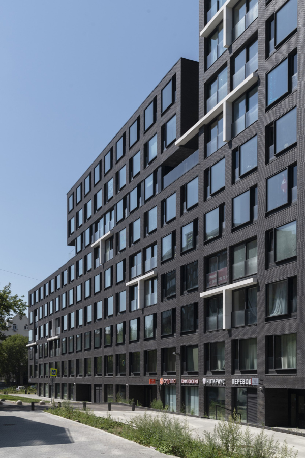 “Garden Quarters” residential complex. 2nd quarter. Buildings 2,5-2,6Copyright: Photograph © Aleksey Naroditsky / provided by Reserve Union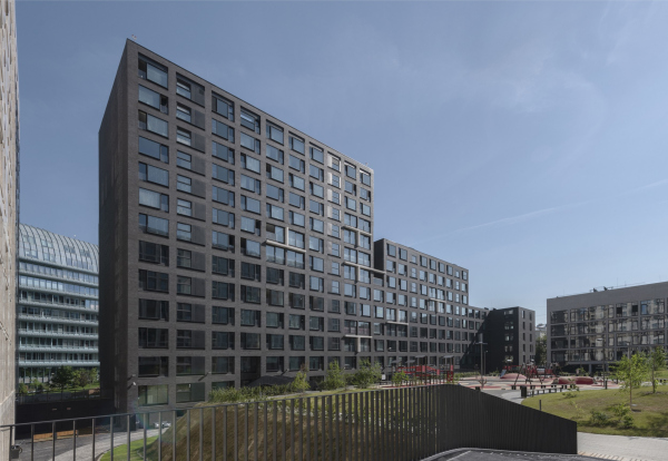 “Garden Quarters” residential complex. 2nd quarter. Buildings 2,5-2,6Copyright: Photograph © Aleksey Naroditsky / provided by Reserve UnionTo begin with, it’s worth noting that the key architects were named very early on, still in 2007, and the buildings were distributed among the architects at the same time; preliminary designs soon followed. However, the second quarter was revised in 2019 to increase its size – it was extended towards 3rd Frunzenskaya Street, which then became a pedestrian boulevard; now, this boulevard provides a convenient access to the café on the “urban balcony” with a view of the inner courtyard. In addition to the building itself and the interior of its lobby, Reserve Union was the general designer of the entire southwestern part of the quarter and worked on the courtyard landscaping project. The courtyard here is arranged similarly to all the other quarters – with the signature curved bridges connecting the green hill in the center to the lobby entrances, starting at the second level. 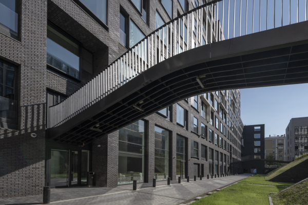 “Garden Quarters” residential complex. 2nd quarter. Buildings 2,5-2,6Copyright: Photograph © Aleksey Naroditsky / provided by Reserve Union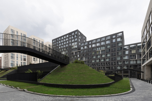 “Garden Quarters” residential complex. Buildings 2,5-2,6Copyright: Photograph © Aleksey Naroditsky / provided by Reserve UnionIn this case, however, there is one level of underground parking beneath the entire courtyard, but in the central part, 2.5 meters of soil has been added on top, allowing trees to grow. The building is extensive, over 100 meters long and 20 meters wide; it has 5 sections, 3 volumes, and 2 units. In spatial terms, it is distributed through the uniform step of three levels: 14 floors closer to the pond, then 9 floors, and then 6. It is worth recalling that not too long ago, this proportion was considered classic, almost ideal. In fact, it still is: it combines three of the most well-known scales of urban development; right next to it, there is a nine-story building from the 1960s and 5-6-story buildings from the 1920s and 1930s. The tall volume “responds” directly to the “Garden Quarters”, so the building not only resonates with all three types of heights found nearby but also unifies them, breaking them down into a clear pattern of one-two-three. “Garden Quarters” residential complexCopyright: © Reserve UnionThe result is three large, measured steps, with a slight expansion at the end, which form a compact volume with well-balanced proportions when viewed from the city. “Garden Quarters” residential complex. 2nd quarter. Buildings 2,5-2,6Copyright: Photograph © Aleksey Naroditsky / provided by Reserve Union“Garden Quarters” residential complex. 2nd quarter. Buildings 2,5-2,6Copyright: Photograph © Aleksey Naroditsky / provided by Reserve UnionIn the design code of the “Garden Quarters”, the façade material held a significant place: natural stone and brick. Here, we have dark, small-format brick, almost black, although in the 2019 design, the facade tone was more burgundy. There are also some inclusions of stone, bright white, which stand out well against the more traditional light beige limestone facades of the neighboring buildings designed by Sergey Skuratov and Ostozhenka respectively. The color here is so white that it makes you wonder whether it’s stone at all. We went ahead and checked – yes, it is indeed stone. There is not much of stone here, though: just a bit in the recessed cutout under the cantilever on the side of the main square and there are also some inclusions in the protrusions that form finely drawn and fairly rare figures reminiscent of the letter “T” – some upright, some inverted, and some just a strip, like a casual fragmentary cornice. 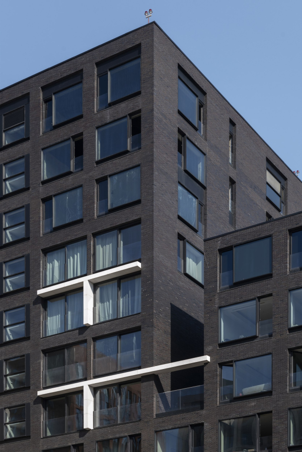 “Garden Quarters” residential complex. 2nd quarter. Buildings 2,5-2,6Copyright: Photograph © Aleksey Naroditsky / provided by Reserve Union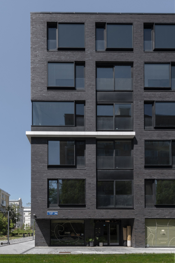 “Garden Quarters” residential complex. 2nd quarter. Buildings 2,5-2,6Copyright: Photograph © Aleksey Naroditsky / provided by Reserve UnionBetween the 14-story and 9-story volumes, there is a deep recess two stories high. It separates the two units, enhancing the caesura and the stepped silhouette – this is undoubtedly an artistic technique to organize the form. As a result, a pair of two-bedroom apartments on the 7th floor and a few smaller apartments in the middle of the building, received open terraces, enclosed on two sides by walls, resembling patios. Here, the white stone horizontals are extended, hinting at pergolas, and seem to “stitch” the two separated volumes together. 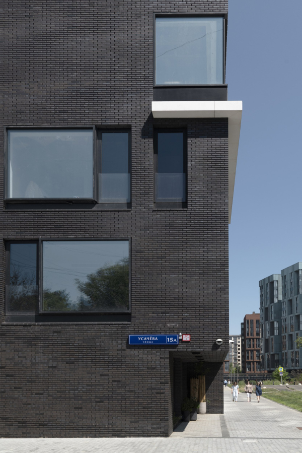 “Garden Quarters” residential complex. 2nd quarter. Buildings 2,5-2,6Copyright: Photograph © Aleksey Naroditsky / provided by Reserve Union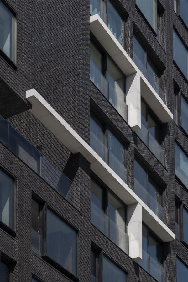 “Garden Quarters” residential complex. 2nd quarter. Buildings 2,5-2,6Copyright: Photograph © Aleksey Naroditsky / provided by Reserve UnionVladimir Plotkin shares that in the original concept, there were not “T-shapes” but crosses or plus signs – in that case, the “stitching” theme would have been more obvious. Nevertheless, the cross-like pattern remains: the strict “checkered” grid, made up of identical vertical and horizontal piers, is enlivened by a few “glass spots” – rectangles composed of four windows with thinner-than-standard piers between them. Initially, all these rectangles were supposed to be outlined with white lines. Later, one “arm” was removed from each intersection, but the essence of the composition – a strict “grid” within which a few spots are asymmetrically scattered – remained unchanged. It goes without saying that this is a “signature” technique of the architect, though here it is presented in a restrained, almost imperceptible manner. It’s interesting and characteristic that the side facades are identical, with the “spots” and “T-shapes” placed directly opposite each other – a fact that can only be understood by studying the drawings or by examining the building very, very closely. However, the carefully calculated measure of variety, as well as the economy and discipline in the expression, is clearly evident in this feature. 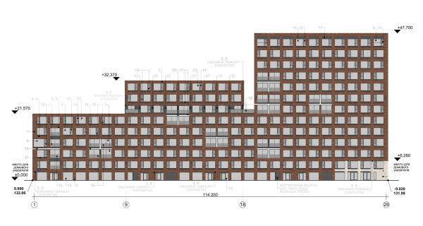 “Garden Quarters” residential complex.Copyright: © Reserve Union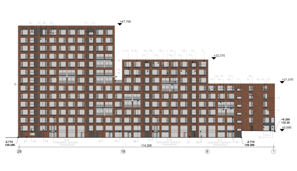 “Garden Quarters” residential complex. Northwest, courtyard, facade layoutCopyright: © Reserve UnionNevertheless, the few white stone strokes unambiguously take on the role of decorative elements. It’s clear that they are meant to break up and enliven the volume, especially in its central part. Sweep of the southeast façadeCopyright: Photograph © Aleksey Naroditsky / provided by Reserve UnionAnd this is despite the minimal decoration. By and large, the building looks very austere. In addition to the T-shaped inserts, the primary decorative element is the windows themselves. Each horizontally oriented opening is divided into two parts: the larger part is designed as a frame, protruding forward beyond the brick plane of the façade, a kind of mini-bay window. The smaller, narrow, and vertical part is, on the contrary, a mini-balcony or rather a macro-vent – a recessed, openable sash with a glass barrier. 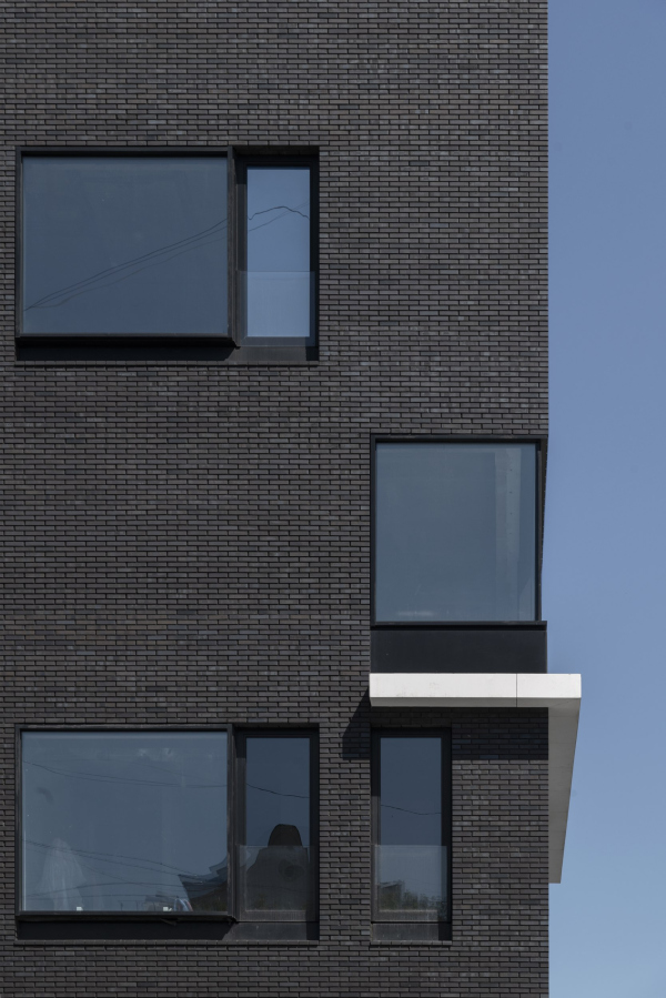 “Garden Quarters” residential complex. 2nd quarter. Buildings 2,5-2,6Copyright: Photograph © Aleksey Naroditsky / provided by Reserve Union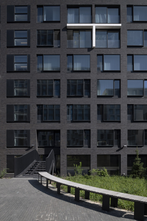 “Garden Quarters” residential complex. 2nd quarter. Buildings 2,5-2,6Copyright: Photograph © Aleksey Naroditsky / provided by Reserve UnionIt almost goes without saying that somewhere in the proportions of the “window unit” used here, the “Golden Ratio” can be detected. Plus, there’s a checkerboard alternation of the sashes: left and right. And that about wraps it up for decoration here. On the end volume, the pattern becomes more complex and engages in a dialogue with the smaller units of “Ostozhenka”. 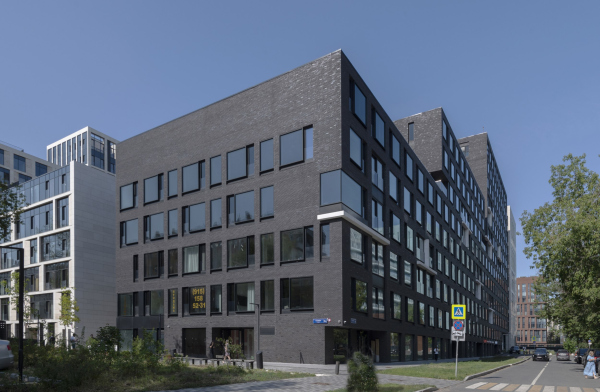 “Garden Quarters” residential complex. 2nd quarter. Buildings 2,5-2,6Copyright: Photograph © Aleksey Naroditsky / provided by Reserve Union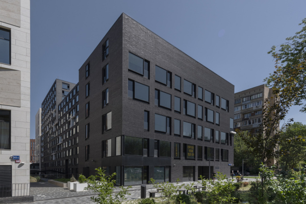 “Garden Quarters” residential complex. 2nd quarter. Buildings 2,5-2,6Copyright: Photograph © Aleksey Naroditsky / provided by Reserve UnionThe laconic solution is enlivened by ledges and recesses. The upper gap echoes the “slit” of the lobby entrance – both, in turn, correspond to similar recesses in the building standing across from Vladimir Plotkin’s house. 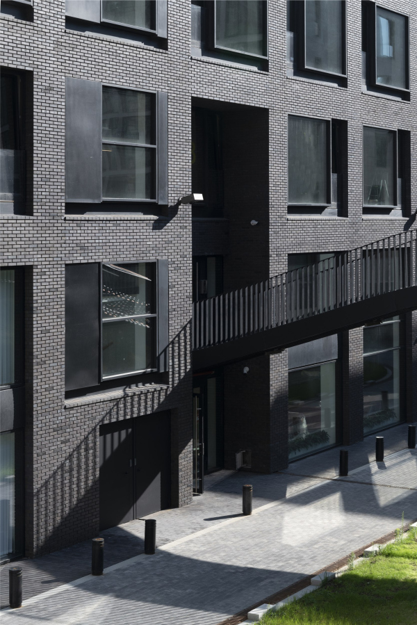 Entrance to the lobby and stairs leading to it on the 2nd tier. “Garden Quarters” residential complex. 2nd quarter. Buildings 2,5-2,6Copyright: Photograph © Aleksey Naroditsky / provided by Reserve Union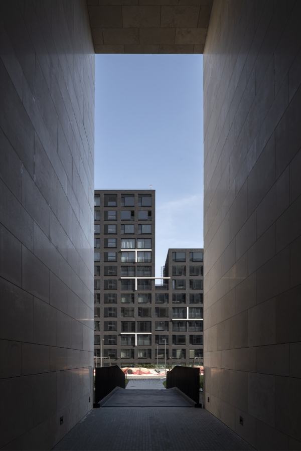 View from a “cut-through” in the next block. “Garden Quarters” residential complex. 2nd quarter. Buildings 2,5-2,6Copyright: Photograph © Aleksey Naroditsky / provided by Reserve UnionThe aforementioned “patio” terrace between the tall and medium volumes is echoed by several other terraces. However, it cannot be said that they significantly impact the plasticity; rather, they accentuate the mass, forming a cantilever here and there. 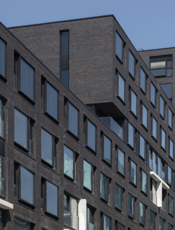 “Garden Quarters” residential complex. 2nd quarter. Buildings 2,5-2,6Copyright: Photograph © Aleksey Naroditsky / provided by Reserve Union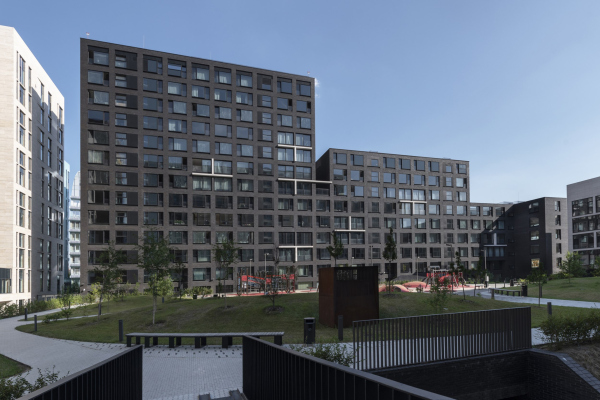 “Garden Quarters” residential complex. 2nd quarter. Buildings 2,5-2,6Copyright: Photograph © Aleksey Naroditsky / provided by Reserve UnionThe interior details are even more intriguing. The top two floors of the 14-story volume are primarily occupied by three apartments with full-fledged two-story layouts, each one of them featuring an internal staircase and its own terrace on the upper floor. Meanwhile, a three-room apartment on the end of the 8th floor has a terrace on the 9th floor, small but private, with access via a staircase. On the 6th floor, the end apartment of the middle volume has a terrace at its level, with another terrace on the 5th floor apartment nearby, also accessible by a staircase. 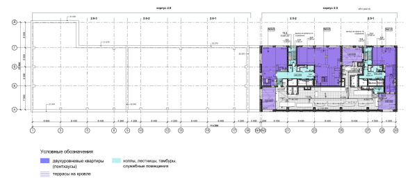 “Garden Quarters” residential complex. 2nd quarter. Plan of the 13 floor. Buildings 2,5-2,6Copyright: © Reserve Union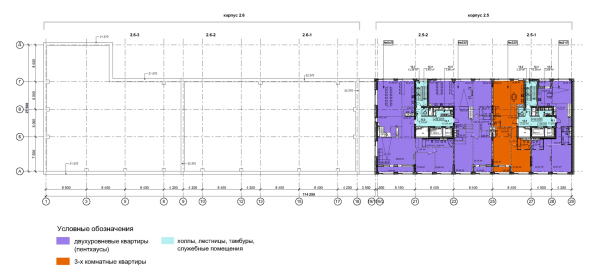 “Garden Quarters” residential complex. 2nd quarter. Plan of the 12 floor. Buildings 2,5-2,6Copyright: © Reserve Union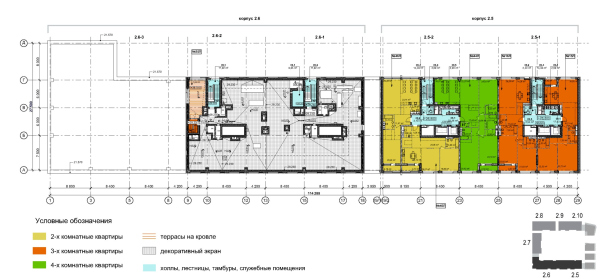 “Garden Quarters” residential complex. 2nd quarter. Plan of the 9 floor. Buildings 2,5-2,6Copyright: © Reserve Union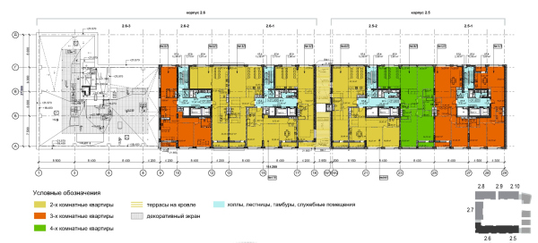 “Garden Quarters” residential complex. 2nd quarter. Plan of the 7 floor. Buildings 2,5-2,6Copyright: © Reserve Union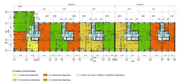 “Garden Quarters” residential complex. Plan of the 5 floor. Buildings 2,5-2,6Copyright: © Reserve Union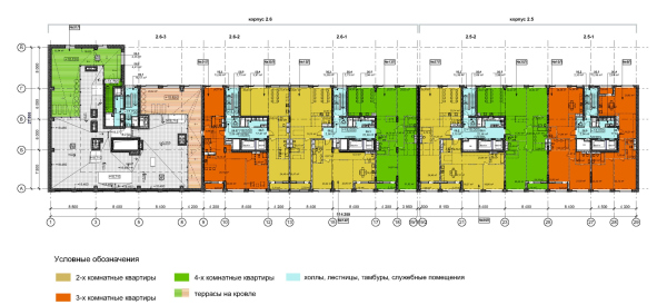 “Garden Quarters” residential complex. 2nd quarter. Plan of the 6 floor. Buildings 2,5-2,6Copyright: © Reserve UnionAll the lobbies in the “Garden Quarters” buildings are high, multi-height spaces; this, by the way, is another modern trend that has fully manifested itself here. In our case, the lobby is almost invisible from the outside, though it can be partially seen through the “city balcony”. Its space is entirely white, with transparent railings, minimalist in design. Here, you understand why the cutout under the corner cantilever reveals a white surface: it unveils the essence of the building’s interior. This technique is well-known and almost elementary, but it is rarely found in such a pure and concise execution. 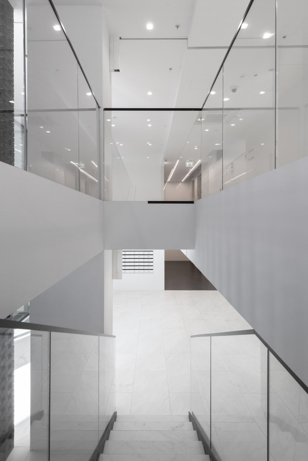 “Garden Quarters” residential complex. 2nd quarter. Buildings 2,5-2,6Copyright: Photograph © Aleksey Naroditsky / provided by Reserve Union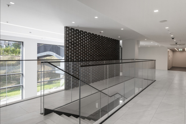 “Garden Quarters” residential complex. Buildings 2,5-2,6Copyright: Photograph © Aleksey Naroditsky / provided by Reserve UnionThe visual “rib of rigidity” is the wall of Spanish brickwork made of the same dark brick, aligned with another brick wall. Needless to say, these are intersected by a white inter-floor slab, reminiscent of the façade’s strokes. “Garden Quarters” residential complex. 2nd quarter. Buildings 2,5-2,6Copyright: Photograph © Aleksey Naroditsky / provided by Reserve UnionThis building completes the “Garden Quarters” and forms one of the entry-exit points to the territory of the complex. The second quarter neighbors the fourth, with one of the widest openings to the city in between, occupied by three nine-story buildings from the 1960s and abundant greenery. Therefore, the building interacts more with its urban neighbors than with Andrey Savin’s “felt boot” building. These buildings do not act as propylea – they rather turn away from each other. In contrast, the building forms a rhythmic pair with the building designed by Ostozhenka, which is both predictable and inevitable, as they are two wings of the same quarter, echoing each other in both the stepped contour and length, as well as the aforementioned vertical cutouts at the top and bottom. And, of course, they make a logic pair as light (almost white but nonetheless beige) versus dark (almost black but nonetheless brown). The other difference is even more important. The architecture of the “Garden Quarters” as a whole is more sculptural – voluminous and material, in the truest sense of the word “material”. The sculptural nature is emphasized by the window slopes, a technique that seems to have become “mainstream” here, along with rounded corners and molded glass. All these elements treat the wall as mass and the building as form. Sergey Choban’s “folding” building fits into this paradigm, while the building designed by “A-B” appears as the apotheosis of sculpturalism, pushing deeply into the realm of art. The sculptural quality is further supported by the texture of the materials: beige limestone, terracotta brick, natural and patinated copper, and weathered steel. The entire complex is beige and terracotta with a single turquoise accent. In such a context, Vladimir Plotkin’s building stands out for its flatness. There are no slopes or rounded edges here. The approach to mass is defined by its relationship to flatness: part of the window slightly protrudes “out”, part slightly recedes “in”, and the facade oscillates between several conceptual parallel layers, structured by a smooth grid of windows. Interestingly, this is the only building within the complex where the primary proportional direction is horizontal rather than vertical. 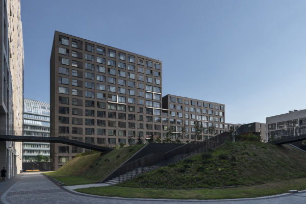 “Garden Quarters” residential complex. 2nd quarter. Buildings 2,5-2,6Copyright: Photograph © Aleksey Naroditsky / provided by Reserve Union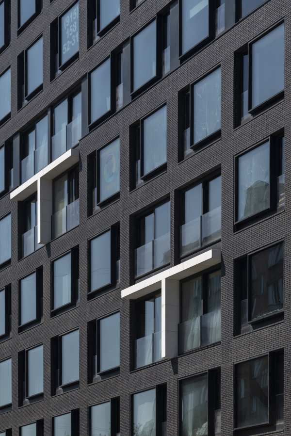 “Garden Quarters” residential complex. 2nd quarter. Buildings 2,5-2,6Copyright: Photograph © Aleksey Naroditsky / provided by Reserve UnionHowever, the horizontal orientation is subtle, avoiding a direct “school notebook” grid pattern. As for the main plane itself, it is formed, according to the design code, with brick, but it is one of the most “dematerialized” types of brick I have ever seen. Brick can be red with emphasized mortar joints, or rough, textured, chipped, and multicolored; both highlight its qualities as an “authentic”, ancient, handcrafted material with texture. Here, what we are seeing is quite the opposite: the brick is flat, with barely visible joints. The brick is also so dark that it appears almost black, though it was originally intended to be burgundy, hinting at some sort of intrigue. When I suggested that the building is black, the author vehemently disagreed – “No! Not black! Dark brown!” It’s worth recalling the color of the rubber for which the factory, once located on the site of the “Garden Quarters” was named. Rubber, in its natural state, is whitish and colorless. However, in my childhood memories, industrial rubber was always black. The Soviet-era factory buildings, like many of their kind, had horizontal ribbon windows. While the building is not explicitly designed to evoke memories of the factory, there is still a subtle connection, clearly visible to a keen observer. The primary color pattern and proportional structure of most buildings in the “Garden Quarters” can be definitely traced back to the 1915 factory administration building designed by Roman Klein, blending terracotta and light beige with vertical proportions, as if “leaping over” most of the 20th century. Only the horizontal orientation and dark tone of Vladimir Plotkin’s building hint – just hint, mind! – at the less-than-glamorous part of the site’s history. 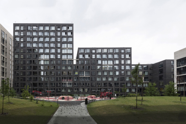 “Garden Quarters” residential complex. 2nd quarter. Buildings 2,5-2,6Copyright: Photograph © Aleksey Naroditsky / provided by Reserve Union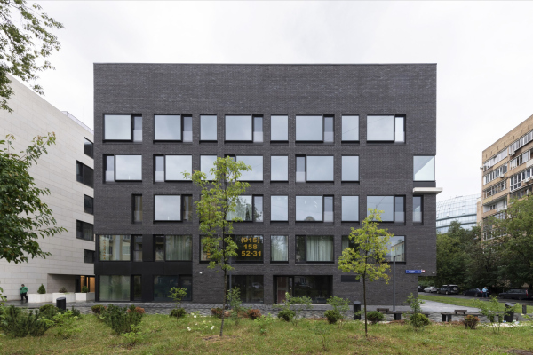 “Garden Quarters” residential complex. 2nd quarter. Buildings 2,5-2,6Copyright: Photograph © Aleksey Naroditsky / provided by Reserve UnionNevertheless, to me, one of the things that the building resembles most is… carbon paper. Imagine an old, worn piece of carbon paper, mostly matte but with occasional shiny spots. Similarly, here, the glass and black metal inserts gleam in places. The T-shaped inserts could be compared to the lines left on carbon paper after particularly forceful drawing, though they more closely resemble elements made of paper – thin and delicate. The white stone here, just like the brick, about which I wrote earlier, doesn’t look entirely material, focusing more on the “white” than the “stone” component. The building itself, especially when viewed from certain angles, emphasizes the flatness of its structure – long and thin: 100 by 20 meters. As a result, most apartments, with few exceptions, face both sides of the building. 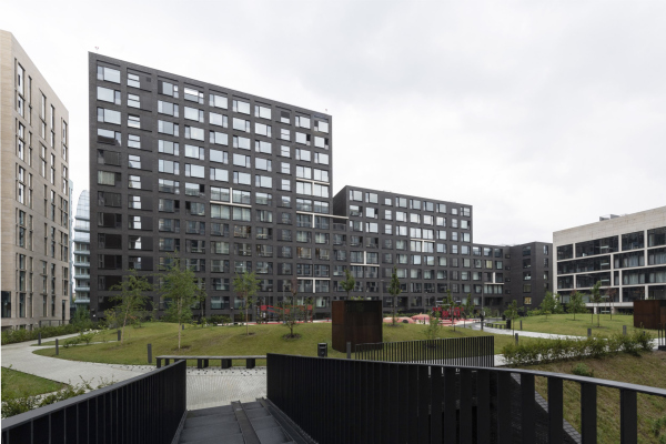 “Garden Quarters” residential complex. Buildings 2,5-2,6Copyright: Photograph © Aleksey Naroditsky / provided by Reserve Union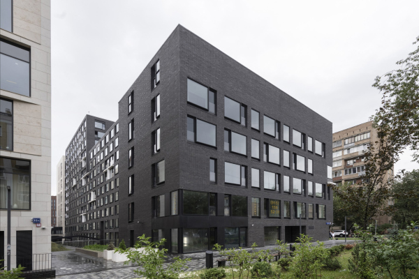 “Garden Quarters” residential complex. 2nd quarter. Buildings 2,5-2,6Copyright: Photograph © Aleksey Naroditsky / provided by Reserve Union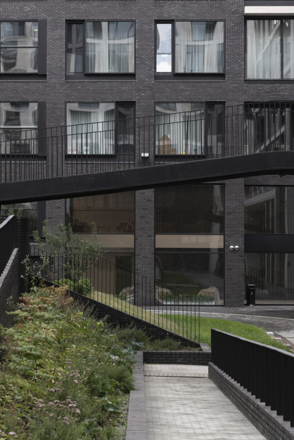 “Garden Quarters” residential complex. Buildings 2,5-2,6Copyright: Photograph © Aleksey Naroditsky / provided by Reserve Union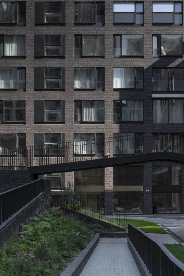 “Garden Quarters” residential complex. Buildings 2,5-2,6Copyright: Photograph © Aleksey Naroditsky / provided by Reserve Union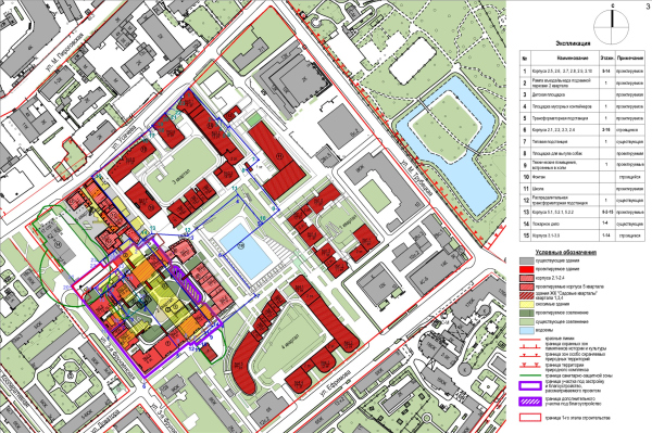 “Garden Quarters” residential complex. Location plan.Copyright: © Reserve Union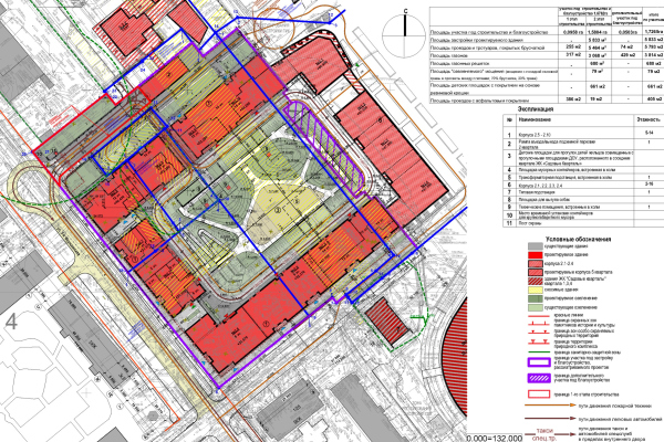 “Garden Quarters” residential complex. The master plan and transport diagramCopyright: © Reserve UnionIt’s not that the building entirely lacks materiality; it is, in fact, quite large. But in organizing its volume, it operates with slightly different parameters than its neighbors do – not with plasticity, curves, or slopes, but with silhouette, rhythm, and proportions. It contains more grid and more mathematics, than matter and volume – like the shadow or projection of the whole quarter. This is what makes this house different, even though otherwise it’s quite in line with the other buildings. |
|
